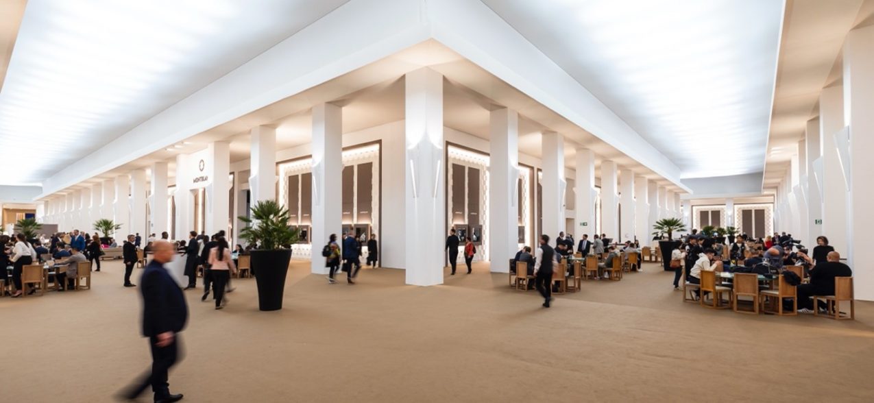
Watches and Wonders has been the first major Swiss watch fair in over two years and, whilst it felt great to be back in a familiar environment, it felt simultaneously strange. The lack of both Asian and Russian attendees meant that the show seemed less busy than expected, but on the whole, it was as if someone had been holding their thumb on the pause button of life and had just now released it.
I have to be honest and say that this was not a show with radical introductions from the big brands, but rather a time to consolidate their positions and to introduce variations on familiar themes. The more adventurous new watches actually came from the smaller firms and the independents.
As always, there seemed to be certain ideas present at many of the stands. Firstly, titanium is now a mainstream case material – everyone from Hermès to A. Lange & Söhne was using it. Secondly, Vignette or Shadow dials – where the colour changes from dark at the rim to light at the centre – were everywhere. When brands as disparate as Vacheron Constantin and Baume & Mercier are both featuring them, you know that this is a trend which is taking off.
Limited to 250 pieces, the new A. Lange & Söhne’s titanium Odysseus features an ice-blue dial made of brass with luminous white-gold hands and appliques…
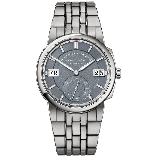
Speaking of trends, it caught my attention the number of watches rushing to fill the vacuum caused by the end of production of the Nautilus and the queues for the Royal Oak. Suddenly the market is full of slim, white metal, three-hand watches on integrated bracelets. It’s not just the serious players like A. Lange & Söhne with their titanium Odysseus or Laurent Ferrier’s Sport Auto in the same metal, but several of the smaller brands are also showing them.
Looking at what caught my eye in closer detail, I have to start with Patek Philippe, who seemingly out of nowhere came up with two of the most interesting watches of the show. One of these is their military styled Annual Calendar Travel Time – ref. 5326G-001 – with a stunning matt grained grey/black dial, applied Arabic indices and “hypodermic needle” hands, all filled with a vintage beige luminescent coating. The annual calendar and travel time functions are two of the most useful complications available, and with this model, Patek Philippe are the first ever brand to combine them, in a sleek 41mm case with a slightly sloped polished bezel. Whilst this model has five apertures on the dial to monitor the sundry functions, its companion release, ref. 5226G-001 has but a single hole in its dial, at 3 o’clock for the date – and, in my opinion, looks all the better for it. It is almost austere in its appearance, the simplicity relieved only by the hobnail “Clous de Paris” finish to the case sides. My guess is that both are going to be the subject of extensive waiting lists before this gets published.
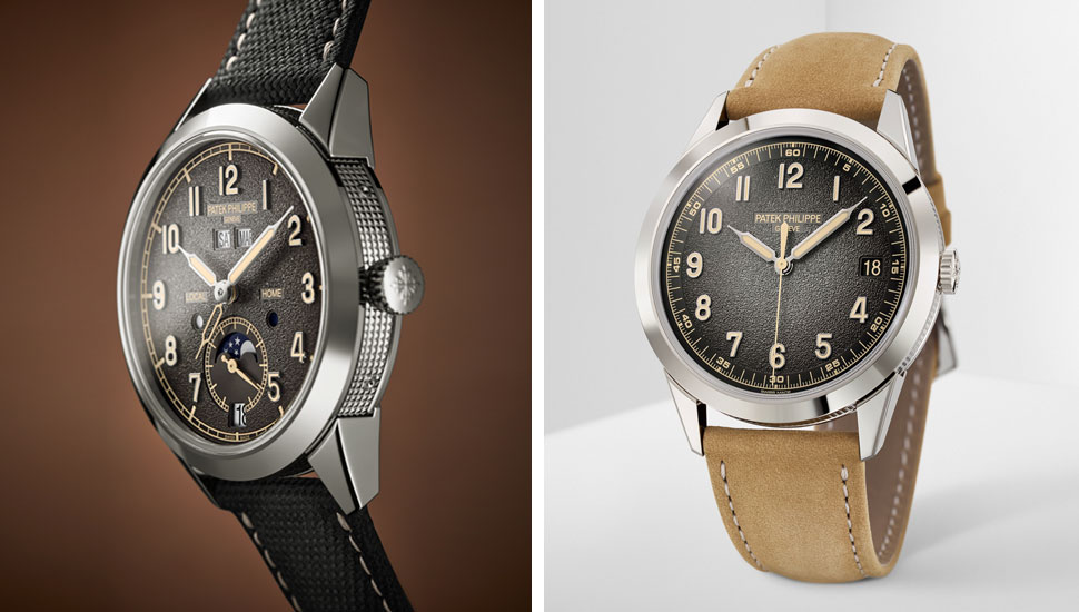
Left: Patek Philippe ref. 5326G-001. Right: Patek Philippe ref. 5226G-001
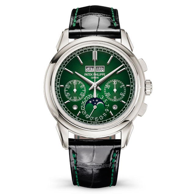
The other outstanding Patek release was a new version of the iconic ref. 5270P perpetual calendar chronograph, cased in platinum, but now featuring a vignette dial which is so bright green at its centre that it should have been launched on St Patrick’s day. Like other versions of the 5270, it is powered by the in-house CH 29-535, introduced just over a decade ago replacing the Lemania CH27 based movement used previously.
In Reference 5270P, the date is shown by a hand and a moon phase at 6 o’clock, as well as a twin day/month aperture at 12 o’clock…
Vacheron Constantin have held on to the same calibre for their perpetual calendar chronograph, the 5000T/000P-B975. Similarly cased in platinum, it now features a beautiful salmon coloured dial with crisp, rectangular white gold baton indices and a stunning solid platinum 3D moonphase disc. From the heart of their archives, they brought out their much loved and missed 222, launched in 1977, just a year after the Nautilus. Unlike its contemporaries, this prime example of ‘70s aesthetics was discontinued after just seven years, what meant that only around 500 of them were ever made. Now part of the Historiques collection, the new 222 iteration – also in 18K yellow gold – uses a conventional three-piece case with a screwed back instead of the original monobloc case construction, where the movement and dial were dropped in through the dial opening and the knurled bezel and glass were then screwed down tightly. The new version has the advantage of being fitted with a sapphire case back allowing an uninterrupted view of the gorgeous in-house 2455/2 movement with its gold rotor embossed with the 222 logo.
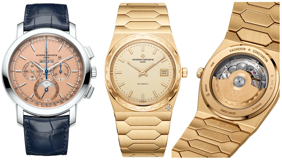
From left: Vacheron Constantin Perpetual Calendar 5000T/000P-B975 and new Historiques 222.
One of the most technically advanced and complicated watches shown at W&W didn’t come from one of the “Grand Maisons” or even one of the independents – rather it came from Grand Seiko. The Kodo already had both a tourbillon and a constant force remontoire, but, for the first time in horological history, they are both on the same axis. This isn’t just aesthetically pleasing; it also reduces the energy loss inherent when using wheels to transmit the impulse from one to another. The esteemed Japanese watchmakers are renowned for their case finishing, and the Kodo is no exception. They made the bold decision to construct the case from 950 platinum and polished titanium; the level of hand finishing and polishing on the case is exquisite, and whilst a quick glance at the case will elicit admiration, a closer inspection under a loupe will leave you in awe.
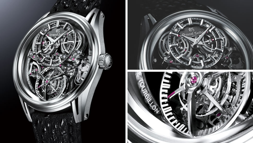
Kodo means heartbeat in Japanese and as such, its innovative movement delivers a level of stable accuracy unprecedented for Grand Seiko.
My Instagram “handle” is MisterRolex, so you might expect me to wax lyrical about the Geneva giant’s introductions, but I won’t – not because I didn’t like them – (far from it!) – but because, like most years, Rolex continued along their path of evolutionary change and avoided anything revolutionary. The most radical introductions were, in fact, simple changes to existing models. Firstly, the GMT Master II is now available in a version designed for left-handed folks who favour reading the time on the right wrist. This involved moving both the crown and the date window through 180∞. The watch has now been given a ceramic bezel in green and black – a hitherto unknown combination. The second evolutionary change has been to the platinum version of their iconic Day-Date model, which historically had a flat polished bezel and now has been given a fluted finish.
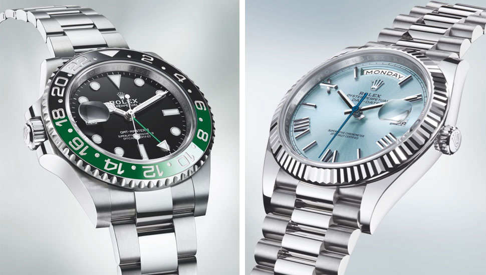
Left: Rolex GMT Master II. Right: Rolex Day-Date 40 Platinum Ice Blue.
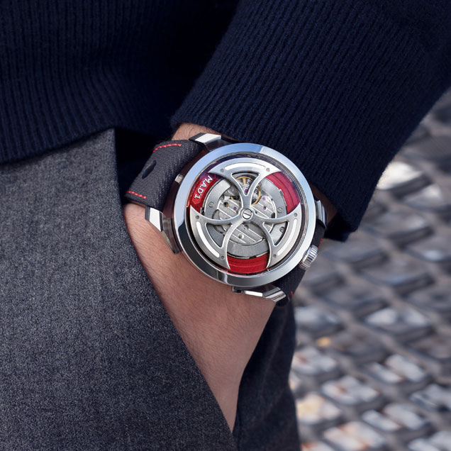
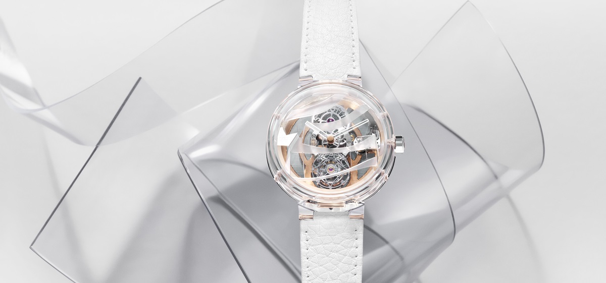
Three watches made me smile. Two were being exhibited and one was a new introduction which I saw on the wrist of a few of my colleagues – the new M.A.D. 1 Red from MB&F. As radical as you’d expect from anything coming out of Max Busser’s boundless imagination, it has no visible dial or hands, so the time is shown by two superimposed cylinders running around the periphery of the case. Using a modified Miyota movement, it is much more accessible than their other pieces, with a price below CHF3,000.
M.A.D. 1 Red displays the time laterally thanks to revolving hour and minute cylinders, engraved and boosted with Super-LumiNova…
The others were also distinguished by their radical approach to telling the time. Firstly, the Hermes Arceau Le Temps Voyageur. Not just another world time watch – nope – this one shows your home time via a window at the top while the local positions itself at your current location and, as you move from one place to another, the dial will follow you around the periphery of the watch.
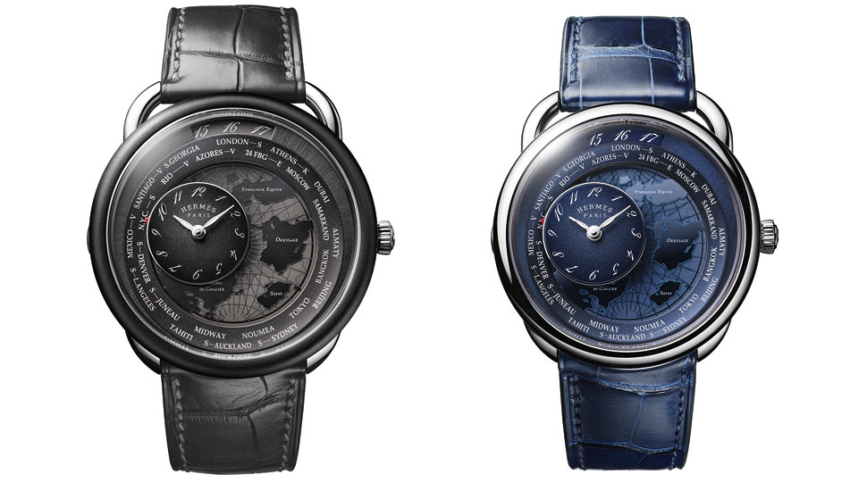
Arceau Le temps voyageur is driven by an exclusive 122-component module, housed within a thickness of just 4.4 mm.
Van Cleef & Arpels’ Lady Arpels Heures Florales is even more extraordinary. There are twelve enamelled flowers on the dial, opening to reveal a diamond or sapphire and the number open at any time represents the hours. The minutes are indicated by a red line which runs around the periphery of the watch between seven and 11. No, it isn’t the easiest way in the world to display the time, but it shows imagination, creativity, craftsmanship and a wry sense of humour which, at times like these, we need as much of it as we can get.
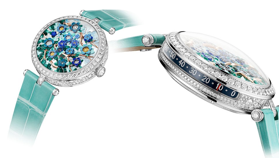
Lady Arpels Heures Florales reinterprets the Flower Clock, where time is told by counting the number of opened flowers.
On the whole, I think that the Watches and Wonders set up is great – by combining the SIHH attendees with the heavy hitters of Baselworld, members of the trade and press are able to see practically everyone they need to in one go, rather than make two visits. Next year, I am going to add on a couple of days so that I can visit the peripheral shows where the smaller, independents were exhibiting. But, for a first attempt, I congratulate the organisers for a fabulous experience.


Show Comments +