

Culture

Treasure Hunting Through the Galleria Borghese

The Galleria Borghese exhibition Metamorphoses is the second incarnation of the innovative collaboration between the Galleria Borghese in Rome and the Rijksmuseum in Amsterdam. Here in Rome, the exhibition arises from the very heart of the collection, which showcases art from the finest masters and iconic works spanning two millennia. The exhibition in Rome is an autonomous and original configuration, bringing together over 80 works from leading European and American museums.  The Galleria Borghese is the perfect setting for this ground-breaking exhibition, Ovid’s poem Metamorphoses was the inspiration for much of the seventeenth century Italian art, gardens and villas and the Villa Borghese is the finest example of these ideals. Scipione Borghese, one of history’s most passionate art collectors, built Villa Borghese to house his immense collection of classical antiquities and Renaissance paintings and sculptures.  Identifying himself with Apollo the god of sun and light, music and poetry, prophecy and knowledge, Scipione Borghese was drawn to him. Consequently, his villa and gardens were heavily influenced by Ovid’s Metamophoses. you only have to gaze around you to see how the frescos on the walls...

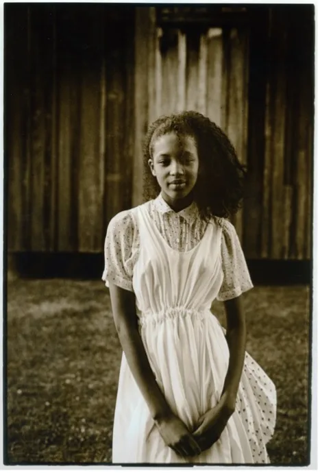
Joel Meyerowitz on America's Mother Road

Celebrating its 100th anniversary in 2026, Route 66 shows no sign of losing its hold on the American imagination. Established in 1926 as one of the original roads in the United States Numbered Highway System, it became far more than a way of getting from one place to another. From Chicago to Santa Monica, its […]

Joy, Speed and Elegance

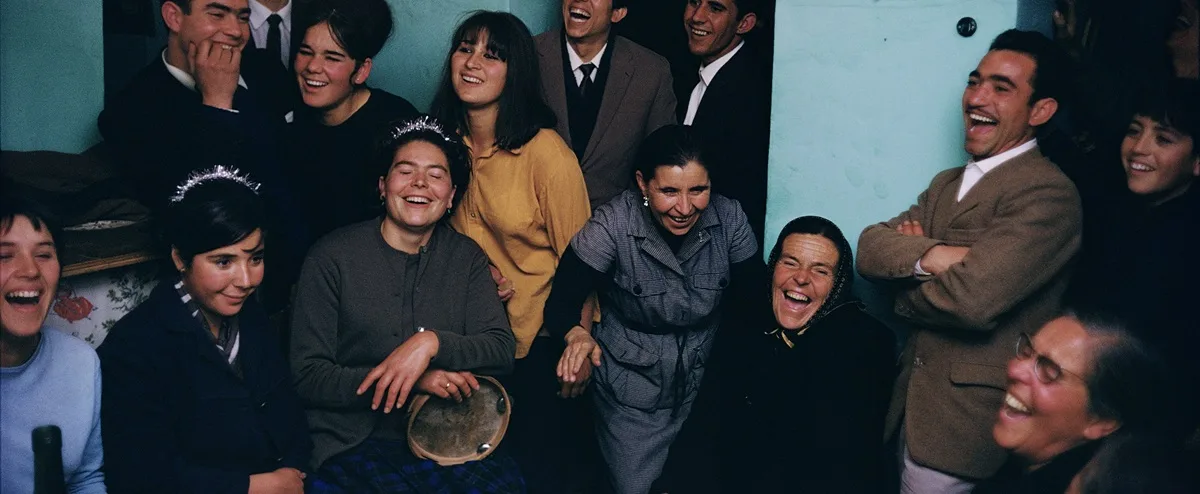
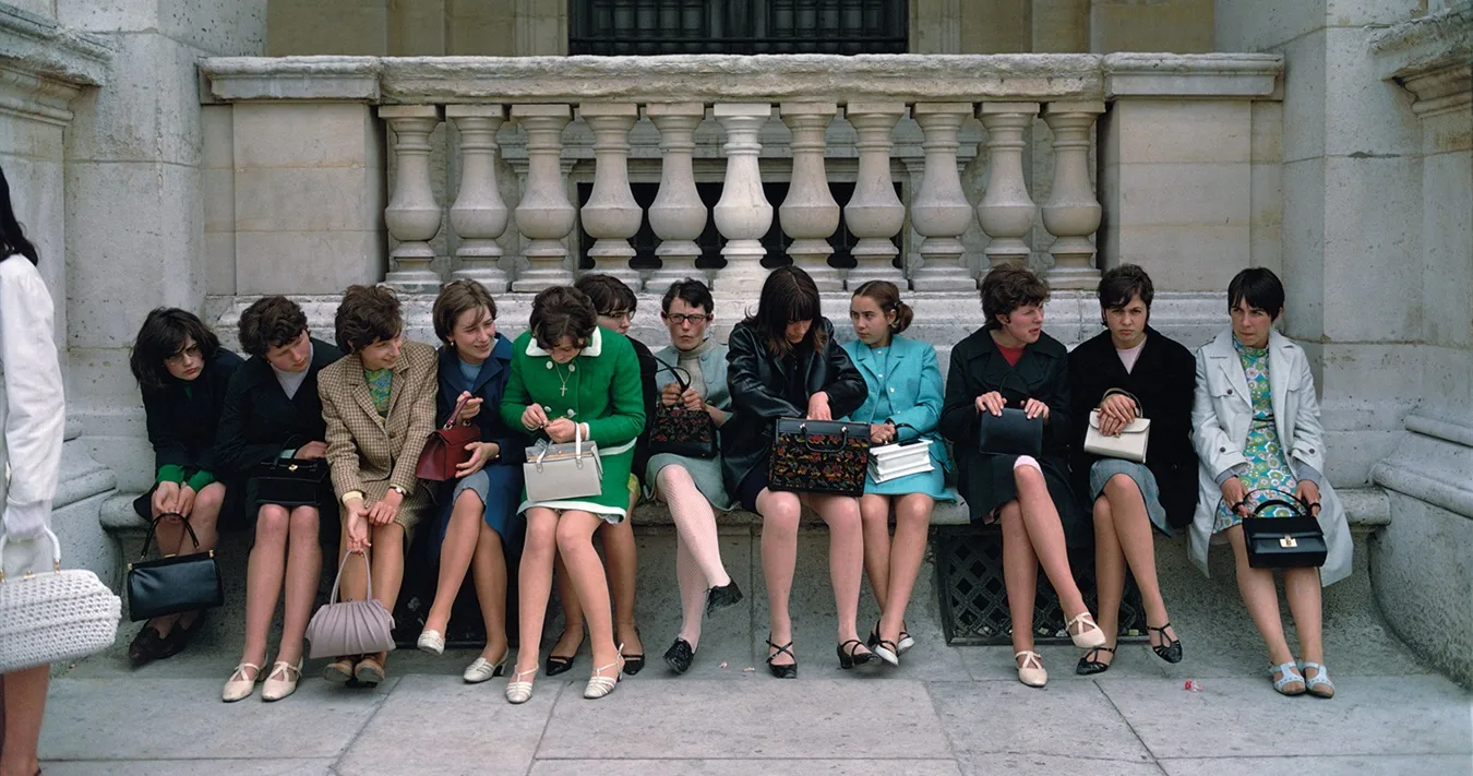
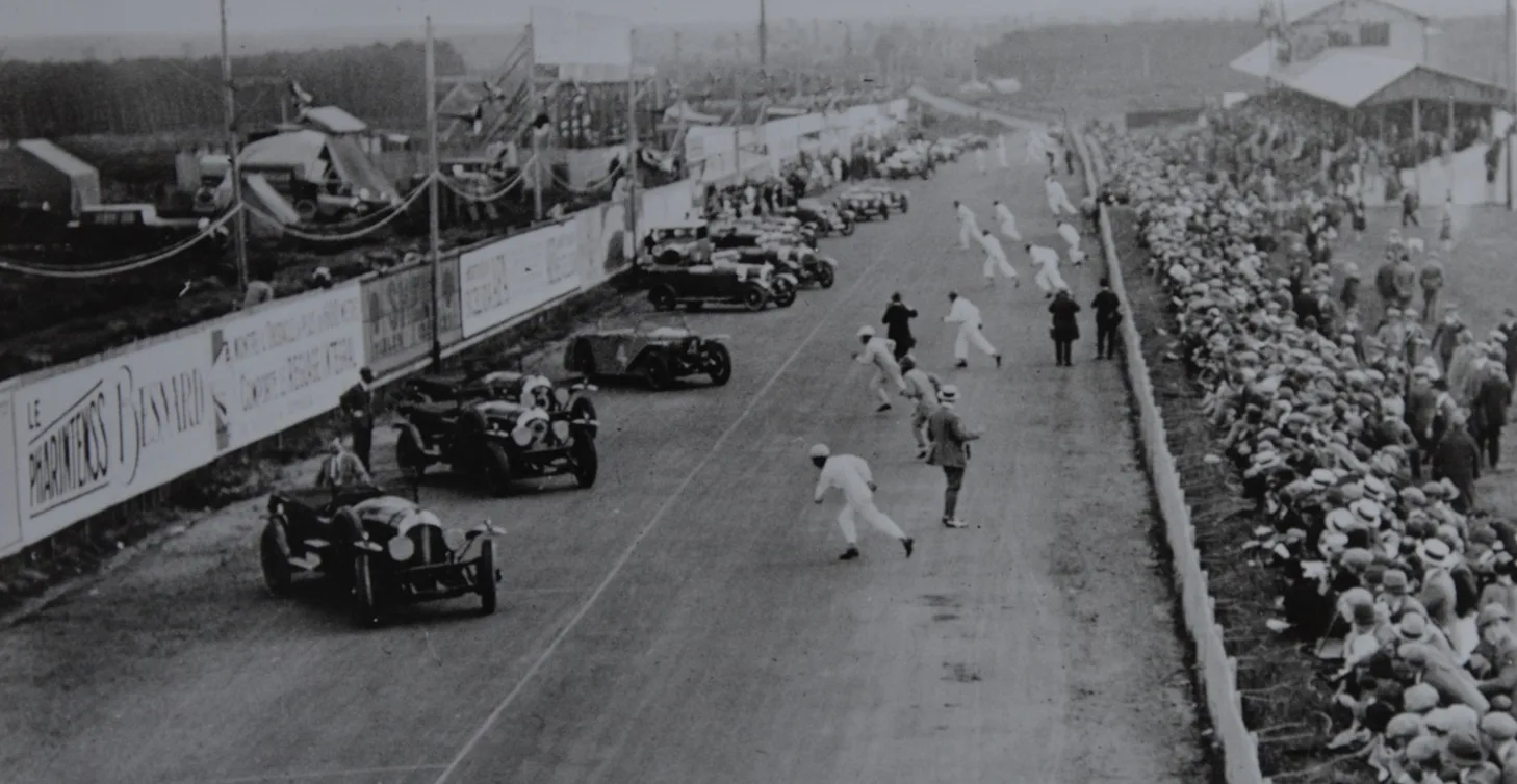
There is something quietly radical about seeing Jacques Henri Lartigue in colour. For decades, his reputation has rested on those buoyant black-and-white images of early 20th-century France: racing cars tilting forward, aeroplanes lifting off, friends caught mid-laugh. They feel unintentional, almost accidental. Life in Colour focuses on a lesser-known strand of Lartigue’s work, bringing together […]

The Anniversary Exhibition at the Brand’s Museum

Half a century after Gérald Genta’s audacious 1976 sketch turned the watch world on its head, Patek Philippe is marking the Nautilus’s golden anniversary in the place where the maison safeguards its own history: the Patek Philippe Museum in Geneva. The new thematic display traces the watch’s unlikely ascent from the “enfant terrible” of 1970s luxury watchmaking – too large, too sporty and, most shockingly for Patek Philippe, made in steel – to one of the most coveted designs in modern horology.

The anniversary also brings a genuinely new chapter for the Nautilus collection. In characteristically understated fashion, Patek Philippe has introduced just four limited-edition pieces, two of which are in white gold (41mm) and one in platinum (38mm), with no added complications. The discreet approach is a clean tribute to Genta’s original vision, allowing the case architecture, alternating polished and satin finishes, and original horizontally embossed blue dial to carry the story. Each is issued in limited editions and carrying a commemorative “50 1976–2026” engraving on the micro-rotor.

Patek Philippe Nautilus 50th anniversary models

L-R, the Nautilus releases to celebrate the half century: the ref. 5610/1P-001, the 5810/1G-001, the 5810G-001, and the ref. 958G-001 desk clock.

Most unexpected of all was the fourth piece. Patek Philippe incorporated the iconic Nautilus design into a white gold desk clock with an eight-day power reserve and an instantaneous calendar. Limited to just 100 pieces and powered by an eight-day manually wound movement, it transforms the familiar wristwatch silhouette into something entirely unexpected and instantly collectable.

It is a quietly confident way to mark fifty years. Where the original 1976 Nautilus shocked Geneva by daring to be made of steel, the 2026 anniversary collection makes its case for survival through pure design discipline, proof that the porthole Genta sketched on a napkin still needs no embellishment to capture the room.

Patek Philippe 50TH Anniversary Nautilus Exhibition Geneva

The Patek Philippe Museum is one of Geneva’s most beloved cultural landmarks, so planning your visit in advance
is strongly recommended. More information and tickets, HERE.

an unforgettable experience. To ensure your visit is seamless and enjoyable, we recommend checking the museum’s opening hours and reserving your tickets online in advance.

Author: Andrew Hildreth

The Dutch Photographer Who Put Postwar Life Under the Skin

There are photographers who observe the world and those who seem to plunge straight into it. Ed van der Elsken belonged firmly to the second camp. Never coolly detached, rarely neutral, he photographed with appetite: for faces, for attitude, for youth, for cities in motion. That instinct is at the heart of Ed van der Elsken. Up Close, a major Rijksmuseum exhibition. Photographs, contact sheets, notes, letters, book dummies and film fragments from a number of Dutch institutional collections are all part of this show that delivers the artist’s electric images and reveals the working mind behind them.

Van der Elsken has long been celebrated as one of the most influential Dutch photographers of the 20th century, a pioneer of street photography, but what is less known is how constructed, searching and experimental that apparent spontaneity could be. Following the joint acquisition of his complete work archive by the Rijksmuseum and the Nederlands Fotomuseum in 2019, curators have been able to study his process in depth for the first time. The result is a layered portrait of an artist who was forever testing how a photograph, a sequence, a book or a moving image might carry emotional force.


Left: Ed van der Elsken, Edam, c. 1973. Nederlands Fotomuseum, Rotterdam.
Right: Ed van der Elsken, Beethovenstraat, Amsterdam, 1967. Nederlands Fotomuseum, Rotterdam.

Born in Amsterdam in 1925, he made his name in Paris in the early 1950s, where he worked in Magnum’s darkrooms and moved among the bohemians of Saint-Germain-des-Prés. His breakthrough photobook, Love on the Left Bank, brought together documentary instinct and cinematic storytelling in a way that helped redefine what a photobook could be. He left aside objectivity and pursued involvement, friction, seduction, recognition.

His range was wider than many remember. Beyond Amsterdam street scenes and rebellious postwar youth, Van der Elsken travelled extensively, photographing and filming in places including Central Africa, Japan, Hong Kong, Mexico and the United States. Jazz, protest movements, avant-garde art, lovers, drifters and everyday urban theatre all found their way into his work. He also moved fluidly between still and moving image, embracing experimental film techniques and cinéma-vérité approaches that made his voice, literally and stylistically, part of the work. That restlessness is one of the most compelling things about him: he was never simply recording life but constantly trying to invent a form equal to its mess and momentum.

Left: Ed van der Elsken, Riot on Queen’s Day, Damrak, Amsterdam, 30 April 1970. Rijksmuseum, Amsterdam.
Middle: Ed van der Elsken, Woman cycling, Amsterdam, 1983. Rijksmuseum, Amsterdam.
Right: Ed van der Elsken, Juliette Kandó, Sèvres, 1950-1954. Rijksmuseum, Amsterdam.

Ed van der Elsken Up Close appears intent on restoring his volatility: the doubts, revisions, false starts and formal play that sat behind the bravado of the finished image. For those who know only the famous photographs, this could be the most interesting part of all. The exhibition invites us to see him not just as a chronicler of postwar modern life, but as an artist who understood that photography could be raw, intimate, subjective and gloriously unfinished.

Author: Lina Ress

Lead image: Ed van der Elsken, Queens Day, Dam, Amsterdam, 1980. Nederlands Fotomuseum, Rotterdam. © Ed van der Elsken estate/Nederlands Fotomuseum.
All image © Ed van der Elsken estate/Nederlands Fotomuseum.

Other unmissable international exhibitions recently reviewed by I-M Inquisitive Minds include Dancing the Revolution, at MCA Chicago; Sylvia Safdie: TERRA at the National Gallery of Canada in Ottawa; and Pomellato, Le Joaillier Révolutionnaire, at the Palais de Tokyo in Paris.

Colour, Courage and Form at The Courtauld

As The Courtauld Gallery opens The Joseph Hage Aaronson & Bremen Exhibition: Hepworth in Colour this summer, London is looking again at Dame Barbara Hepworth, not only as one of Britain’s great modernist abstract sculptors, but as a woman who carved out a life of courage, independence and radical self-determination. She entered a world where our grandmothers’ and great-grandmothers’ only respectable route into adulthood was to get married and have children, Hepworth gained an education, a career and a reputation that continued to grow long after her tragic death in 1975, aged 73.

Born in Wakefield, Yorkshire, in 1903, Hepworth was the daughter of a civil engineer who occasionally took her with him when inspecting roads and bridges. In the eponymous 1961 BBC film directed by John Read, she talked about the lasting impact of these journeys, stating: “The West Riding landscape… the hills were my sculptures; the roads defined the forms.”

The headmistress at Wakefield Girls’ High School recognised her talent and encouraged her to apply for a scholarship at Leeds School of Art. Hepworth later said: “Perhaps what one wants to say is formed in childhood and the rest of one’s life is spent trying to say it.” She grew to believe that sculpture “should and could embody the rhythms of life itself”.

A charismatic woman, capable of forming lifelong friendships, including one with Henry Moore, she became part of the European avant-garde set of the 1930s, based in Hampstead, London. Here, her abstract sculptures began to push the boundaries of the modern British movement and, by the time she was 30, she had married, become a mother to a son and divorced the artist John Skeaping. She went on to have triplets with painter Ben Nicholson in 1934, and wed him in 1938.
Left: Barbara Hepworth (1903-1975), Sculpture with Colour (Oval Form) Pale Blue and Red, 1943. Wakefield Permanent Art Collection.
Right: Barbara Hepworth (1903-1975), Drawing for Sculpture with Colour (Forms with Red and Blue), 1941. Private Collection. © Bowness.

A year later, as war loomed, the family was invited to Carbis Bay, St Ives, by art critic Adrian Stokes and his then-wife, artist Margaret Mellis. They relocated five days before the declaration of war, with Hepworth taking a single sculpture and a handful of tools with her. Cornwall, with its rugged landscapes, endless skies, beautiful bays and temperate climate, soon became home, providing her with inspiration until her death in a studio fire.

By day, she dedicated herself to raising four children. By night, she produced an extraordinary portfolio of drawings, which she described as “sculptures in disguise”. War-time rations meant materials were scarce, and working within a small studio forced Hepworth to create smaller sculptures, often from plaster, which she sold to support her family.

That genius is now lauded worldwide. The Hepworth Wakefield, named in her honour, celebrates her artistic legacy and houses a nationally important collection of 20th-century British art. Its latest acquisition, Sculpture with Colour (Oval Form) Pale Blue and Red (1943), was bought by a private collector shortly after it was created and remained hidden from public view for nearly 80 years. Faced with the possibility of it being lost to the nation once more, The Hepworth Wakefield and Art Fund raised the £3.8m asking price.

The sculpture dances with moving shadows; its pale blue pigment, inspired by Cornish skies and sea, contrasts with Hepworth’s signature red string, which she said represented “the tension I felt between myself and the sea, the wind or hill”.

“Hepworth – Rhythm and Form” art trail by 45 Park Lane takes guests to sites such as Kenwood House (left), to admire Hepworth’s Monolith (Empyrean), the nine-foot-tall memorial to her son, Paul Skeaping, who was killed while serving in the RAF in 1953 and to
John Lewis (right) to view her iconic Winged Figure (1961-2).

Hepworth had been interested in colour since the mid-1930s, but Cornwall pushed her work in a new direction and deepened that fascination. She worked in layers, exploring the patination and colouration of bronze and plaster, carefully selecting colours to suit particular pieces. This passion sits at the heart of Hepworth in Colour at The Courtauld Gallery, the first exhibition to explore this facet of her work in depth.

Bringing together 20 sculptures and 30 drawings and paintings, the Courtauld show highlights early war years pieces sold to private collectors, as well as works from the 1950s and 1960s that reveal how colour continued to occupy Hepworth in new ways, including through patinated bronzes and painted marbles.

Alongside Hepworth in Colour, The Courtauld Gallery is also showing Hepworth and Nicholson: The Hampstead Studio Photographs, an edit of rare images of the couple’s shared workspace at No. 7 Mall Studios in Hampstead. Taken in 1933 by Paul Laib, they are among the most evocative studio photographs to emerge in Britain and show the interrelation of the artists’ practices at the time.

Meanwhile, another London landmark of modernism, 45 Park Lane, originally designed by the renowned Bauhaus architect Walter Gropius – a good friend of Hepworth –  and part of the Dorchester Collection, is also paying homage to her genius this year, with the “Hepworth – Rhythm and Form” art trail). In this tour, guests explore sites associated with the radical British sculptor across London, including Kenwood House, where the Hepworth sculpture Monolith (Empyrean) is located; her home and studio in Hampstead; the Isokon building, considered the Hampstead Modernists’ headquarters; and John Lewis on Oxford Street to view Hepworth’s iconic Winged Figure.

Here, a celebratory guide brings her extraordinary life into sharp focus, with anecdotes revealing how Hepworth’s life intertwined with some of the liveliest minds of the 20th century, including Piet Mondrian, Roland Penrose and Lee Miller. London is alive with Hepworth this summer, finally bringing her vision “to infuse art with life and life with art” to the fore.

Hepworth in Colour
The Courtauld Gallery, London
12 June – 6 September 2026
More information and tickets, HERE.

Author: Rebecca Dickson

This is a reduced version of the longer, more in-depth feature about Barbara Hepworth appearing in our summer issue, on sale 17 June. Reserve your copy, HERE.

Other exhibitions in London this summer recommended by I-M Inquisitive Minds include Marilyn Monroe: A Portrait, at the National Portrait Gallery; Schiaparelli: Fashion Becomes Art at the V&A South Kensington; and Winston Churchill: The Painter at The Wallace Collection

Lead image: Barbara Hepworth. © Alamy.

A Milanese Jewellery Revolution in Paris

Founded in Milan in 1967 by Pino Rabolini, Pomellato arrived at a moment when fashion, design and women’s lives were being rewritten, and treated jewellery with the same modern instinct that Italian prêt-à-porter was bringing to clothes: desirable, sensual, independent and made to be lived in.

That spirit sits at the centre of Pomellato, Le Joaillier Révolutionnaire, the maison’s first Paris exhibition, staged at the Palais de Tokyo and curated by Alba Cappellieri, Head of Jewellery Design at the Politecnico di Milano. Rather than presenting Pomellato as a chronology of products, The show cleverly frames the history of Pomellato as a series of revolutions: of image, craftsmanship, colour, style and women. It is a very smart decision, because Pomellato’s importance has always been as much cultural as it is decorative.

Iconic campaigns for Pomellato by (L-R) Helmut Newton (1982); Albert Watson (1985); and Michel Comte (1994) featuring Charlotte Rampling.

The most captivating section may be the “Revolution of Image”. Pomellato understood unusually early that jewellery could live through photography as much as it did through vitrines. Campaigns by Gian Paolo Barbieri, Helmut Newton, Albert Watson, Horst P. Horst, Snowdon, Javier Vallhonrat, Michel Comte and, newly folded into the story here, Herb Ritts, show how the maison used image-making to shape a woman who was not passive, ornamental or waiting to be admired. She was cinematic, self-possessed, often slightly dangerous. Newton’s 1982 campaign, with its woman in dark glasses beside a bulldog, still feels like a manifesto for jewellery as attitude.

The Palais de Tokyo is the ideal location for such an exhibition. Known for experimentation, large-scale installations and raw spaces, this is an audacious and pioneering museum that invites contemporary creation. Pomellato’s jewels are deeply experimental: their rounded volumes, saturated gems and tactile gold, belong to the language of bodies, clothes, skin and movement. The chains, from Gourmette and Boule to Catene and Iconica, are especially important. Pomellato took a form often treated as functional and gave it character, weight and sensuality.

L-R: Gourmette bracelets (1981); Asimmetrico bracelet (2000); and Nudo rings (2001), all pieces by Pomellato.

Colour is another act of rebellion. In a conservative jewellery world historically obsessed with hierarchy, Pomellato made room for pleasure: cabochons, unexpected stones, generous cuts, tonal clashes and the luminous simplicity of Nudo. Its “Free Gems” philosophy feels less like branding than a worldview, one in which value is emotional as well as material.

The exhibition’s final and most persuasive argument is Pomellato’s relationship with women. Through Pomellato for Women, founded in 2017, the maison connects its original 1960s spirit of female independence to contemporary conversations around equality and gender-based violence.

What emerges from this show is not just a portrait of a jeweller, but of a particularly Milanese kind of revolution: sophisticated, seductive, pragmatic and quietly radical.

Pomellato: Le Joaillier Révolutionnaire
24 June – 20 July, 2026
Palais de Tokyo
Free entry with reservation from 1 June, at pomellato.com

Author: Lina Ress

Lead image: Gian Paolo Barbieri for Pomellato (1971)

The Woman Behind the Hollywood Myth

Timed to mark the centenary of Marilyn’s birth, Marilyn Monroe: A Portrait is a landmark exhibition that brings together paintings, photographs and rarely seen material to discover the real woman behind the most recognisable face in 20th-century popular culture, the woman who understood, perhaps better than anyone, how images could both build and imprison a life.

That is what makes this exhibition feel so substantial. The National Portrait Gallery is not simply presenting Marilyn as Hollywood relic, tragic blonde or Pop fantasy. It is foregrounding her as an active participant in her own making: a performer who worked the camera with intelligence, instinct and control, and who would direct shoots and veto pictures she disliked.

This matters because Marilyn’s image has long suffered from overexposure and under-reading. We all know the platinum hair, the half-smile, the white dress over the subway grate. But the enduring fascination lies in the tension between surface and self-possession. The gallery’s decision to frame her through portraiture works. Portraiture is never just about likeness; it is about power, projection and what remains elusive, left to the imagination of the viewer.

Left: Marilyn Monroe, 1946, by André De Dienes, © André de Dienes / MUUS Collection.
Middle: Marilyn Monroe (reading Ulysses by James Joyce), Mount Sinai, Long Island, 1955, by Eve Arnold. © Eve Arnold Estate.
Right: Marilyn Monroe, 1962, by Allan Grant, © 1962 MM LLC (Photographs by Allan Grant).

The line-up alone is enough to suggest the scale of the undertaking. There are photographs by Richard Avedon, Cecil Beaton, Eve Arnold, André de Dienes, Philippe Halsman and Milton Greene, alongside works by Andy Warhol, Pauline Boty and James Gill. Warhol’s Marilyns, of course, remain the defining act of canonisation. As MoMA notes of Gold Marilyn Monroe, he based the work on a publicity still from Niagara, turning Monroe’s face into an icon suspended between celebrity culture and religious devotion. In other words, he embalmed Marilyn in modern myth.

Pauline Boty offers something more tender and more cutting. Her Colour Her Gone (1962), created in the wake of Marilyn’s death, actively subverts the sexualised male gaze. Thi oil-on-canvas masterpiece shifts the narrative away from Hollywood glamour to offer a deeply empathetic, woman-to-woman tribute. That is one of the strengths of the exhibition’s premise: it lets us see how different artists used Monroe to think about glamour, femininity, grief and fame itself.

Then there are the photographers who knew her in the round. Eve Arnold, for one, had a relationship built on trust. Marilyn came to see her in a pseudo-maternal role. Over a decade, Arnold photographed the star six times, capturing candid, naturalistic images that cut through the typical, male-dominated shots of the era. Milton Greene, too, was not a passing image-maker but a close collaborator whose archive describes years of friendship and repeated work together.

Left: Colour Her Gone, 1962, by Pauline Boty. © Pauline Boty Estate, Reproduction by permission of Wolverhampton Art Gallery.
Right: Green Marilyn, 1962, by Andy Warhol, © 2026 The Andy Warhol Foundation for the Visual Arts, Inc.

Perhaps the exhibition’s most affecting draw, however, will be the previously unseen Allan Grant photographs made at Marilyn’s Brentwood home just a day before her death. Grant shot 432 images, of which only eight were originally published, capturing Marilyn in moods that shift from brightness to introspection. It is hard to imagine a more poignant closing note: not Marilyn the slogan, but Marilyn in the fragile space between performance and private reckoning.

The timing is clever. Across the river, BFI Southbank is also marking the centenary with Marilyn Monroe: Self-Made Star, a season explicitly designed to move beyond the tired caricature of Marilyn as tragic sex symbol and instead stress her intelligence, ambition and role in reshaping her own career. The National Portrait Gallery’s show appears to be doing something similar in visual terms.

Ultimately, this is a seminal show for all fans of Marilyn, and an essential destination for those who want to discover the brilliant woman behind the sex symbol.

Marilyn Monroe: A Portrait
National Portrait Gallery
4 June – 6 September 2026
More information and tickets, HERE.

Author: Lina Ress

Lead image: Marilyn Monroe, Ballerina Sitting, 1954, by Milton H. Greene. Milton H. Greene © MHG Collective, LLC.

Other unmissable art shows this summer in London include Schiaparelli: Fashion Becomes Art at the V&A South Kensington, Winston Churchill: The Painter at The Wallace Collection, and The Serpentine Pavilion 2026, a serpentine at Serpentine South.

Isabel Abascal and Alessandro Arienzo Bend the Rules

For its 25th edition, the Serpentine Pavilion commissioned LANZA atelier, the Mexico City-based practice founded by Isabel Abascal and Alessandro Arienzo, whose design, a serpentine, is rooted in one of England’s most ingenious architectural forms: the crinkle-crankle wall.

The design is spectacular in its modesty. Its winding brick wall curves across the lawn at Serpentine South, borrowing its name both from this historic garden structure and from the nearby lake. The form is not just decorative, but structurally brilliant.  The crinkle-crankle wall is gains stability from its undulation while using fewer bricks than a straight wall. In LANZA atelier’s hands, it becomes both boundary and invitation, an architecture of pause, movement and discovery.

Exterior and interior view (design renders) of the Serpentine Pavilion 2026 by LANZA atelier. © LANZA atelier. Courtesy Serpentine.

For Abascal, the question of how a body inhabits space is not abstract. Her research into birth and caregiving has led her to think of architecture “not as an object to be observed, but as an environment that welcomes bodies, movement and human connection.” She links this to the profoundly atmospheric conditions of birth itself, where light, gravity, intimacy and proximity become fundamental. That sensibility carries into a serpentine, which is conceived not as a fixed route, but as a sequence of invitations. Visitors may cross through it, rest within it, move around it, touch it, listen to it, or simply allow the space to reveal itself slowly.

The Pavilion has been designed for movement. The crinkle-crankle wall greets visitors on arrival, while a long curving brick bench invites passers-by to sit, turning the edge of the Pavilion into a place of gathering. From the outside, the structure hints at an interior without immediately giving it away. As visitors approach, what first appears solid begins to dematerialise: stacked bricks form slim columns, small gaps open between them, and the wall becomes permeable. Inside, an enfilade of delicate brick columns draws the eye towards Serpentine South Gallery, while the translucent roof filters natural light, allowing the interior to change throughout the day as shadows move across the brickwork like a living painting.

Brick gives the Pavilion its warmth and tactility. Chosen partly in conversation with the brick façade of Serpentine South, originally built as a tea pavilion, the material lends the project a sense of continuity. A second wall responds to the surrounding tree canopy, while the roof rests lightly above the brick columns, allowing air and light to pass through. The overall effect is that of a permeable space for gathering, movement and public life.

Left: Conceptual sketch (worm’s eye view) of the Serpentine Pavilion 2026 by LANZA atelier. © LANZA atelier. Courtesy Serpentine.
Right: LANZA atelier, chairs for 4 couples dining set, 2020. Photo: Fernando Ocaña.

Alessandro Arienzo sees the crinkle-crankle wall as a type rich with intelligence rather than a historical curiosity. “Our work often begins with studying architectural types,” he explains, “not as fixed historical forms, but as repositories of accumulated knowledge that can be reinterpreted for the present.” For him, the wall’s appeal lies in the way it achieves “structural efficiency, spatial richness and material economy through its smart geometry.” There is also a pleasing linguistic and symbolic loop: serpentine names a wall, a lake and a place. For architects working from Mexico, where the serpent holds a powerful place in Mesoamerican cosmology, the coincidence adds another layer of resonance. As Arienzo notes, this is the first Serpentine Pavilion to truly revolve around the serpentine.

LANZA atelier also designed the chairs and stools for the Pavilion, made locally in sapele hardwood, continuing their belief that furniture and architecture belong to the same conversation, simply at different scales.

The studio’s process is equally grounded. For this project, Abascal and Arienzo worked through hundreds of hand drawings, pencil studies, models, samples and full-scale mock-ups. Drawing, for them, is not presentation but thought. “As architects we should be able to build less and simpler,” they say. “For us, the drawing is as important as the building.” That attitude gives a serpentine its clarity. Simplicity here is not a lack of ambition, but the result of refinement.

Rolex’s new role as Official Timepiece of the Serpentine Pavilion adds another layer to the commission’s cultural significance. The partnership feels particularly apt: a project built around precision, craft, material intelligence and long-term cultural value, supported by a brand increasingly invested in architecture through its wider Perpetual Arts Initiative.

Trade the city rush for dappled light and park views: London’s most inspiring summer pop-up is here.

Serpentine Pavilion 2026, a serpentine
Serpentine South, London
6 June – 25 October
More information and tickets, HERE.

Author: Julia Pasarón

Earth, Memory and the Quiet Weight of Time

Now on view at the National Gallery of Canadam Sylvia Safdie: TERRA, feels disarmingly modest. There is no drama, there are no pyrotechnics, just her lifelong, primal relationship with the Earth, using literal raw soil as her primary art medium.

This is the first major exhibition dedicated to the Montreal-based artist at the institution and it arrives, perhaps belatedly, as a corrective. Safdie has long occupied a curious position in Canadian art: widely respected, yet rarely foregrounded. TERRA makes a convincing case for her quiet persistence over five decades.

What emerges across the 19 works on display is not a linear narrative but a way of thinking. Safdie works with earth, stone, wax, bronze and pigment not as materials, but possibly more importantly ,as carriers of memory. Her practice sits somewhere between sculpture, archaeology and meditation.

The centrepiece, Earth II (1977–2025), is deceptively simple: hundreds of small piles of soil collected over nearly half a century. Yet its impact is cumulative. Each sample is tied to a place, a moment, a relationship. Seen together, they form an archive that resists borders and hierarchies. The work feels particularly resonant now, in an era defined by both displacement and ecological anxiety.

Left: Sylvia Safdie, Earth Marks Series XVIII, No. 5 (detail), 2002–20, earth, graphite, oil on Mylar.
Middle: Sylvia Safdie, Heads Series IV, No. 5, 2010, earth, graphite, oil on Mylar, 206 × 107 cm.
Right: Sylvia Safdie, Heads (detail), 1993–2021, stone, steel, bronze, wax, 13 × 360 × 182 cm.
All images courtesy of the artist. © Sylvia Safdie. Photo: Richard-Max Tremblay.

Safdie’s approach has often been described as contemplative, and that is accurate, though perhaps insufficient. There is also a quiet insistence at play. In Assemblages II, begun in the 1980s and completed this year, natural objects sit alongside their cast counterparts in glass, bronze and steel. The doubling is both subtle and unsettling. It raises questions about authenticity, permanence and the human impulse to replicate the natural world in more durable forms.

Her paintings, particularly the Earth Marks series, extend this inquiry. Made with linseed oil and raw pigments drawn from her own collection of soils, they are literally composed of the material they reference. From a distance, they read as abstract gestures; up close, they begin to suggest landscapes, bodies, even traces of movement. Safdie has often spoken about transformation, and here it unfolds slowly, almost imperceptibly.

Sylvia Safdie: TERRA exhibition, National Gallery of Canada.

Over a multi-decade career, Sylvia Safdie has rejected traditional synthetic paints to masterfully use unrefined dirt, sand
and dust to paint, sculpt and build grand-scale installations. Sylvia Safdie portrait by Patrick Andrew Boivin

If there is a tension in the exhibition, it lies in its restraint. For some, the absence of overt narrative or political framing may feel elusive but to me, it is also its strength. Safdie’s work resists easy interpretation. It asks for attention rather than reaction.

In recent years, there has been renewed interest in artists working with natural materials and ecological themes. Safdie, however, is not following a trend. She has been doing this since the 1970s, long before such concerns entered the mainstream of contemporary art discourse.

TERRA does not seek to overwhelm. Instead, it accumulates meaning slowly, like sediment. By the end, what lingers is not a single image, but a heightened awareness of material itself, and of our place within it.

Sylvia Safdie: TERRA
National Gallery of Canada
10 December 2025 – 25 October 2026
More information and tickets, HERE.

Author: Lina Ress

Lead image: Sylvia Safdie, Assemblages II (detail), 1986–2025. Courtesy of the artist. © Sylvia Safdie. Photo: Simon Belleau.

Other international exhibitions recommended by I-M Inquisitive Minds include Dancing the Revolution, MCA Chicago; Carol Bove, Guggenheim New York; and Pedagogies of WarMuseo Thyssen-Bornemisza Madrid.

A Private Life on Canvas

When Winston Churchill is brought back into view, it is usually as war leader, orator, bulldog spirit of defiance. Much less often is he considered as a painter, which is precisely what makes Winston Churchill: The Painter such an intriguing proposition. Opening at the Wallace Collection this May, the exhibition is billed as the first substantial UK show devoted to his art since his death, bringing together more than 50 works, many from private collections rarely seen in public.

That alone gives the exhibition a certain charge. Churchill’s painting has long hovered at the edge of his public story, treated as an appealing footnote rather than a serious part of his inner life. Yet he produced more than 500 canvases over five decades, beginning in 1915, when painting became both consolation and discipline after the Dardanelles disaster. The Wallace Collection’s chronological approach promises to show not a hobbyist dabbler, but a man who kept returning to the canvas with persistence, appetite and, eventually, confidence.

What emerges from the exhibition materials is not the image of a great hidden master, which would be a silly claim, but something more compelling: Churchill as an intelligent, committed amateur whose paintings reveal a side of him politics could never hold. The range sounds impressive. There are wartime scenes, still lifes, views of Chartwell, harbours in the South of France and Italy, and the Moroccan landscapes that became the high point of his painterly maturity. The studio at Chartwell, now under the care of the National Trust, still holds the largest collection of his paintings, which helps explain why works from his home loom large in this show.

Left: Sir Winston Churchill, The Beach at Walmer C316 (1938) America’s National Churchill Museum at Westminster College, Fulton, Missouri.
Right: Sir Winston Churchill, The Goldfish Pool at Chartwell C344 (1932). Private Collection. Photo: Matthew Hollow.

Both images © Churchill Heritage Ltd.

The Morocco pictures are likely to be among the main attractions. Churchill made six visits to Marrakech between 1935 and 1959, drawn to its light, colour and the theatrical contrast between foliage, plain and mountain. The most famous result was The Tower of the Koutoubia Mosque, painted after the Casablanca Conference in January 1943, when Churchill persuaded Franklin D Roosevelt to join him in Marrakech. It was, as the exhibition notes, the only painting Churchill made during the Second World War.

There is also a pleasing sub-plot in the Royal Academy story. Encouraged by Sir Alfred Munnings, Churchill submitted works to the Summer Exhibition in 1947 under the pseudonym David Winter. When his identity emerged, the novelty was irresistible, but so too was the broader point: he wanted the work judged before the name. He was elected Honorary Academician Extraordinary the following year, a distinction that confirmed painting as something more than private therapy or aristocratic pastime.

The real interest of this exhibition, though, lies not in whether Churchill can be ranked among major British painters. He cannot. It lies in what painting offered him: silence, control, pleasure, concentration. The Wallace Collection describes a figure defined by politics but sustained by art, and that feels exactly right.

For all Churchill’s monumentality in public life, painting seems to have returned him to something more human: a man standing before a canvas, looking for balance, light and calm. That may be the most revealing portrait of all.


Winston Churchill: The Painter
The Wallace Collection
23 May – 29 November 2026
More information and tickets,
HERE.

Author: Lina Ress

Lead image: Sir Winston Churchill painting in Belgium, September 1946 (c) Churchill Archives Centre, CSCT 5-6-160.

A Masterclass in Beautiful Disobedience

At the V&A South Kensington, Schiaparelli: Fashion Becomes Art is a reminder that Elsa Schiaparelli treated fashion as provocation, performance, wit and visual shock long before such words became part of the industry’s default vocabulary.

Born in Rome in 1890, Schiaparelli arrived in Paris with none of the obedient instincts expected of a couturier. Where Chanel streamlined the modern woman, Schiaparelli disturbed her, amused her and armed her with imagination. Hollywood stars, wealthy socialites and the era’s most independently minded women wore Schiaparelli.

Left: Elsa Schiaparelli and Salvador Dalí, Skeleton Dress (1938). V&A © 2025 Salvador Dalí, Fundació Gala-Salvador Dalí, DACS. Photo © Emil Larsson.
Middle: Salvador Dalí, Telephone (1938). © Salvador Dalí, Gala-Salvador Dalí FoundationDACS, London 2026.
Right: Schiaparelli: Fashion Becomes Art at V&A South Kensington. Photo: David Parry / PA Media Assignments.

She famously said, “For me, dress designing is not a profession but an art.” Her trompe l’oeil bow sweater of 1927 announced the method: a garment could be practical and still play tricks on the eye. From there came sportswear, city suits, eveningwear and accessories that refused to behave: shoe hats, fantastical buttons, embroidered faces, skeleton ribs and lobsters placed where lobsters had no business being.

The V&A understands that Schiaparelli’s genius was not simply eccentricity, but how smart she was about the alliances she established. Across more than 400 objects, the exhibition places her clothes in conversation with the artists who helped shape her world: Salvador Dalí, Jean Cocteau, Man Ray, Pablo Picasso, Eileen Agar and others. Rather than fashion T “inspired by” art, her work represented fashion operating as art’s most intimate, unruly cousin. The Skeleton dress and Tears dress still unsettle because they turn the body into a site of illusion, injury and desire.

Left: Schiaparelli Haute Couture Fall Winter 2024. Photo © Giovanni Giannoni.
Middle: Kuba Dabrowski Awar Odhiang, Paris, 2025. Schiaparelli by Daniel Roseberry. Haute couture AW 2024 © Kuba Dabrowski.
Right: Schiaparelli Haute Couture Fall Winter 2024 Look 30. Photo © Giovanni Giannoni.
All three images courtesy of Patrimonie Schiaparelli, Paris.

What gives the show extra weight is its London thread. Schiaparelli opened a Mayfair salon in 1933, and the exhibition restores that chapter with rare garments bearing the London label, including pieces connected to coronation dressing, British clients and the city’s own surrealist circles. It makes the V&A setting feel a lot like a homecoming.

The final section brings the story to Daniel Roseberry, Schiaparelli’s American creative director since 2019. Roseberry has made the house culturally visible again, by absorbing the DNA of the maison and enlarging it for the red carpet age. His gilded anatomy, exaggerated silhouettes and celebrity moments can be spectacular to the point of theatre, but here they make sense. It pays tribute to the spirit of Schiaparelli: to make the impossible walk into the room.

Schiaparelli: Fashion Becomes Art
V&A South Kensington
The Sainsbury Gallery
28 March – 8 November 2026
More information and tickets, HERE.

Author: Lina Ress

Lead image: Mae West wearing Elsa Schiaparelli in Every Day’s A Holiday (1937). Moviestore Collection Ltd – Alamy.

Sign-up to our newsletter

To be the first one to receive our latest news, exclusive offers and gifts.

This field is for validation purposes and should be left unchanged.

Tick the categories below that appeal to you:

Categories(Required)