This May, Firsts London returns to the Saatchi Gallery with a burst of colour, curiosity, and craftsmanship. The theme? Books in Bloom – a celebration of all things botanical in the world of rare books.
From ancient herbals to avant-garde floral art books, over a hundred rare book dealers from around the globe will gather to showcase the intertwined histories of books and botany. It’s the literary companion to the Chelsea Flower Show, blooming just down the road – but with more vellum and fewer tulips.
Expect everything from medicinal manuscripts to pressed flower albums, poetic tributes to roses, and gorgeously illustrated plant encyclopaedias. Botanical books tell a story far richer than just plants on a page. They chart centuries of exploration, science, superstition, art – and obsession.
Once used to treat fevers and fend off spirits, early plant drawings became tools of classification, trade, and desire. By the Victorian age, they were full-blown objects of beauty, their detailed engravings and watercolours capturing the global explosion of flora newly ‘discovered’ and imported.
Justin Croft Antiquarian has brought an exquisite edition of Baudelaire’s Les Fleurs du Mal,…
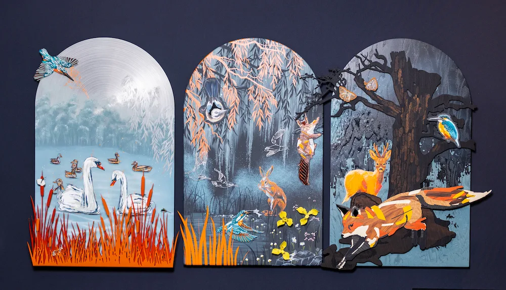
Britain's most famous luxury car marque brings woodland magic to London Craft Week
At this year’s London Craft Week (12–18 May 2025), Rolls-Royce Motor Cars is bringing a captivating artistic display that reimagines the British countryside in exquisite detail and craftsmanship. Created by artisans at the marque’s Goodwood headquarters, the triptych artwork draws on the flora and fauna of the British Isles, presenting a woodland scene across three […]
Mesmerising mythology at a major new sculpture exhibition in Norfolk
Mythological beasts stalk the grounds of Houghton Hall – in a good way. The stately home in Norfolk is presenting Stephen Cox: Myth, an absorbing new exhibition of the work of the British sculptor. Arranged across the park gardens and interiors, this is the most comprehensive retrospective ever of the Royal Academician’s sculpture. Covering more […]
Arguably the greatest sculptor of all time, Donatello (1386-1466) was in the vanguard of a revolution in sculptural practice in the early Renaissance. This exhibition gives a unique vision of Donatello’s genius and significant role at this critical time in European culture, highlighting works never seen before in the UK, including his early marble David and bronze Attis-Amorino from the Museo Nazionale del Bargello, Florence; the spectacular San Rossore Reliquary bust from the Museo Nazionale di San Matteo, Pisa; and bronzes from the High Altar of the Basilica of St Anthony in Padua.
For the first time, the V&A’s exquisitely carved shallow relief of TheAscension with Christ giving the keys to St Peter will be displayed alongside the Madonna of the Clouds from the Museum of Fine Arts, Boston, and Desiderio da Settignano’s Panciatichi Madonna from the Museo Nazionale del Bargello, providing an exclusive opportunity to see these works together.
David Victorious, 1408-9; 1416, marble, courtesy of Museo Nazionale del Bargello, Firenze, and the Ministry of Culture. Photo by Bruno Bruchi.
Focusing primarily on Donatello’s lifetime and immediate followers, the show combines a thematic approach with chronological one, encompassing the inter-relationship between sculpture, paintings, drawings, and goldsmiths’ work. Donatello’s innovative technique and his ability to combine ideas from both classical and medieval sculpture created works that were novel, but with an element of the traditional. Key works by the master himself are complemented by carefully selected pieces by Donatello’s contemporaries and followers that explore and expand on the sculptor’s major place within the development of Renaissance art and its context, as well as inter-relationships across materials.
Comprising around 130 objects, the exhibition also incorporate a considerable number of objects from the V&A’s own collections – including the most extensive holdings of Italian Renaissance sculpture outside Italy – notably from the Medieval & Renaissance Galleries. These are accompanied by copies of Italian Renaissance sculptures, including several by Donatello, in the museum’s Weston Cast Court. Donatello: Sculpting the Renaissance is the last in a series of exhibitions made possible through collaboration with Fondazione Palazzo Strozzi and the Museo Nazionale del Bargello in Florence, and the Staatliche Museen zu Berlin.
Donatello, Attis-Amorino, bronze, courtesy of Museo Nazionale del Bargello, Firenze and The Ministry of Culture Italy. Photo by Bruno Bruchi.
Visitors have the chance to view works attributed to Donatello and Desiderio da Settignano, St. John the Baptist Martelli marble, courtesy of Museo Nazionale del Bargello Firenze and The Ministry of Culture Italy; David Victorious (1408-9); 1416, marble, courtesy of Museo Nazionale del Bargello, Firenze Su concessione del Ministero della Cultura (photo Bruno Bruchi); Two Adoring Angels marble, courtesy of the Victoria and Albert Museum London and, last but not least, Spiritello with a tambourine, courtesy of Skulpturensammlung und Museum für Byzantinische Kunst der Staatlichen Museen zu Berlin (photo Antje Voigt).
Many institutions have drawn on their own collections and curatorial expertise to stage three distinct but complementary exhibitions, offering a celebration of Donatello’s life and work in three parts, the first to be devoted to the artist for 40 years.
Donatello: Sculpting the Renaissance
The V&A South Kensington, Cromwell Road, London SW7 2RL
Eliza Butterworth is, without a doubt, one of the most gregarious, warm and passionate people I have ever interviewed. Beautiful, animated and vivacious, her enthusiasm is infectious. I found myself thinking, “I want to be her, and if I can’t be her, then I want to be her friend.”
Her parents met in Nebraska, where her mother – who is from an Italian-American family – was training to be a nurse and her father – who hails from Lancashire – was a pilot in the Royal Air Force, so, although she was born and raised in Lincoln, she found herself travelling to the American Midwest during summers to spend time with her mother’s family. Much of her warmth radiates from her Northern roots, and she attributes it to the kindness of her “absolutely gorgeous” father.
Eliza credits her early interest in acting to her parents, in particular her eccentric and larger- than-life mother, Edie. “My mother is a wonderful icon that I’ve always looked up to, and still do,” she shares. Witnessing her glamorous and captivating personality, Eliza equated this to the world of acting, and listening to the varied accents of her family from both sides of the pond further fuelled her passion for mimicry and characterisation. At the age of 15, she told her mother that she wished to pursue an acting career, at which point Edie threw herself on the ground (theatrics obviously run in the family) asking, “Why would you want to do that?”
“My mother is a wonderful icon that I’ve always looked up to, and still do.”
– Eliza Butterworth
Eliza took part in plays at The Lincoln Minster School and with the support of her teachers there she applied for a place at drama school. Having had no prior exposure to the thespian world, she says she approached auditions like “a deer in headlights, but without expectations”. Her relaxed mentality of “I’ll have a go and if I’m successful then that is an omen, otherwise I will go in a different direction” (in her case, believe it or not, dentistry) paid off though as, at the tender age of 18, she was accepted into The Royal Academy of Dramatic Art (RADA). Being the youngest in her class, she was a “malleable blank canvas” and was open to absorbing all training and instruction on offer. She graduated in 2014. It was during her time at RADA that her parents recognised her passion, talent and commitment to her chosen field, and to this day, they avidly follow not only Eliza’s career and projects, but also those of her fellow cast members. “My mom even has me on Google Alerts. Forget Kris Jenner, Edie Butterworth is the ultimate momager… on a budget.”
The roles she was assigned during her final year at RADA – the year in which industry professionals start taking notice – all seemed to feature Eliza playing an older character – somebody’s mother, grandmother and, it seemed, every battle-axe you could think of, but she wholeheartedly embraced the fun and transformative side. Whether this be tapping into another dimension of her underlying American heritage personality, or the challenge of portraying somebody completely opposite to who she is, it was all regarded by her as a learning curve
Eliza as Queen Aelswith of Wessex, the wife of King Alfred, in the epic medieval Netflix drama, The Last Kingdom.
It clearly stood her in good stead as she was cast to play Queen Aelswith of Wessex, the headstrong wife of the cunning monarch, King Alfred, played by David Dawson, in the epic medieval Netflix drama The Last Kingdom. Having taken the part aged just 21, Eliza, who sees little of the formidable Queen in her own personality, has since aged roughly a decade per season as the series strides through history and the bloody formation of modern England. So by the time they reached season 5, Eliza Butterworth, who is now 28, was portraying a woman at least 35 years her senior, a challenge only exacerbated by the fact that her on-screen daughter, played by Millie Brady, is the same age as her in real-life.
Eliza’s first foray into TV was enlightening. “Working with such a fabulous cast and forming family-type relationships as each season carried on, helped us to flesh out these wonderful characters, who were actually real people,” she explains. “A lot of the characters actually did exist. There’s something really nice about tapping into them as well.”
Eliza’s can-do personality and acting ability became apparent during an incident during the filming of an episode of The Last Kingdom. As with most productions, there were amendments and re-writes of the script. Eliza had just prepared for a huge scene involving a family loss by studiously learning and rehearsing her lines, but as they began filming, the lead actor stopped and asked why her lines didn’t match the script he had prepared for. It was only then that she discovered she had inadvertently been issued the original script, which was seven drafts behind the one being used. Mortified and wondering how she was going to learn the new scene in five minutes, the director came to the rescue and requested a hybrid script encompassing parts of the original, which meant Eliza had to learn only ten new lines. It also required her to break down in tears, and Eliza describes herself as “some sort of sociopath” as she was able to pull it all off.
“When I originally got into acting it was because I loved theatre.”
– Eliza Butterworth
Eliza’s latest project is called A Town Called Malice, which she describes as a phenomenal crime thriller set in the 1980s. The story is about the criminal Lord family from Bermondsey, who, fleeing from trouble in South London, find themselves on Spain’s Costa del Sol. Filmed in anamorphic style with gorgeous cinematic visuals, she sees the stunning soundtrack as “a driving force for the show, almost creating a character itself”.
Chaos follows the family wherever they go. “They are such a fun, crazy, wacky, wonderful family that you end up falling in love with every single character,” she comments with affection, “However,” she adds, “each of them has their own agenda.”
In A Town Called Malice, Eliza plays Carly, the wife of the eldest of the Lord family sons.
Before A Town Called Malice, viewers can catch Eliza in The North Water, a TV miniseries about a disgraced ex-army surgeon who joins a ship crew as a doctor as they head off on an expedition to the Arctic for a whaling mission. Also starring Colin Farrell and Jack O’Connell, and directed by Andrew Haigh, the show weaves themes of toxic masculinity and morality against the backdrop of the Arctic. “I play ‘a lady of the night’ in a few episodes,” she says laughing. “What I loved the most was observing Colin Farrell work. He’s an absolute legend.”
Although her TV career is blossoming, Eliza’s main interest is in theatre work. “When I originally got into acting it was because I loved theatre,” she explains. She made her West End debut playing Princess Eugenie in the 2021 satirical comedy The Windsors: End Game at the Prince of Wales theatre.
But, for all her love of stage work, for now Eliza’s main focus is A Town Called Malice – and she is full of enthusiasm for the series. Eliza says it’s “a bit in your face, but with beautiful, subtle moments that pepper the script with emotion”. She describes her character Carly – the wife of the eldest of the Lord family sons – as “warm-hearted, loyal and fabulous but often overlooked by the rest of the Lord family because she comes across as quite ditzy. As the show evolves though, the lioness side of her comes through.”
A Town Called Malice releases on Sky Max with NOW on 16th March.
For the first time in the history of the Rijksmuseum, the largest-ever retrospective exhibition of Vermeer has been organised, with the collaboration of the Mauritshuis in The Hague. Johannes Vermeer (1632–1675) is, without a doubt, one of the most significant artists of the 17th century. Both museums conducted exhaustive research about Vermeer’s artistry, his motivations for his compositions, as well as into the creative process of his paintings.
His work is best known for his tranquil, introverted indoor scenes, his unprecedented use of bright, colourful light and his convincing illusionism. In contrast to Rembrandt, Vermeer left quite a small body of work – about 35 paintings. As they are generally considered the most prized treasures of every museum collection, Vermeers are rarely lent out, so this show is a rare opportunity to see so many works of the artist under one roof.
Girl With a Pearl Earring, was lost soon after being finished, resurfacing 200 years later after being bought for pocket change. Since 1902, it has been housed by the Mauritshuis in The Hague.
Vermeer lived and worked in Delft, although none of his paintings are owned or displayed in his hometown. The Rijksmuseum itself has four masterpieces by the Dutch genius, including the world-famous Milkmaid and The Little Street. The Mauritshuis is lending Girl with a Pearl Earring – probably one of the most recognisable paintings in the world – as well as Vermeer’s View of Delft and Diana and her Nymphs. Other works that visitors can admire in this exhibition include The Geographer (Städel Museum, Frankfurt am Main), Lady Writing a Letter with her Maid (The National Gallery of Ireland, Dublin) and Woman Holding a Balance (The National Gallery of Art, Washington DC). Works never before shown to the public in The Netherlands include the newly restored Girl Reading a Letter at the Open Window from the Gemäldegalerie Alte Meister in Dresden.
View of Houses in Delft is an unusual painting for Vermeer, featuring ordinary houses. The artist’s aunt Ariaentgen Claes and her children lived in the house on the right.
Visitors can also try to see if they notice a couple of objects in The Milkmaid, which Vermeer painted over at a later stage: a jug holder and a fire basket. This discovery has been possible thanks to the use of the latest technology, including Macro-XRF and RIS scanning, which has enabled a team of curators, conservators and scientists from the Rijksmuseum to collaborate closely with colleagues from the Mauritshuis in The Hague and the University of Antwerp to conduct new research into Vermeers’s paintings. One can’t help but wonder what else hides in the Dutch master’s canvases.
Except for the trickle of milk, everything else in The Milkmaid is still, a snapshot of domestic life, which Vermeer painted with unparalleled mastery.
Parallel to this show, the city of Delft is running a parallel exhibition exploring the cultural-historical context in which Vermeer’s practice flourished, with works loaned from all over the world. This exhibition also showcases works by contemporaries of Vermeer, displayed alongside Delft pottery, Delft carpets, archival materials, and letters.
Rijksmuseum. Bezoekadres, Museumstraat 1, Amsterdam 1071 XX
Audiences will get the chance to view the spectacular art in new Exhibition on Screen film, Vermeer: The Greatest Exhibition,which invites cinema audiences to a private view of the show. The film will be released in UK cinemas nationwide on 18th April. Watch the trailerHERE.
Words: Lavinia Dickson-Robinson
Opening picture: Partial view of A Lady Writing, Johannes Vermeer, 1664-67, oil on canvas. National Gallery of Art, Washington. Gift of Harry Waldron Havemeyer and Horace Havemeyer, Jr., in memory of their father, Horace Havemeyer.
Other images:
The Milkmaid, Johannes Vermeer, 1658-59, oil on canvas. Rijksmuseum, Amsterdam.
Girl with a Pearl Earring, 1664–67, oil on canvas. Mauritshuis, The Hague, bequest of Arnoldus Andries des Tombe, The Hague.
View of Houses in Delft, known as “The Little Street”, Johannes Vermeer, c. 1658-59, oil on canvas. Rijksmuseum, Amsterdam. Gift of H.W.A. Deterding, London.
Argentine-born Julio Le Parc is a major figure in art history. As a leading experimental artist, precursor of Kinetic Art and Op Art, he was a founding member of the Groupe de Recherche d’Art Visuel (GRAV). In 1966, he received the Grand Prize for Painting at the 33rd Venice Biennale and the Konex Award from Argentina in 1982 and 2022. This socially conscious artist was expelled from France in May 1968 after participating in the Atelier Populaire and its protests against major institutions, growing himself a reputation as a major disruptor.
At 94 years of age, he is more in demand than ever, with solo shows being organised by international galleries across the globe, from Paris to Miami, New York to Punta del Este. His work has sold for six figures on the secondary market and belongs in the collections of the Museum of Modern Art, the Tate, the Centre Pompidou, the Guggenheim Museum, the Museo Reina Sofía, the Museo de Arte Contemporáneo de Buenos Aires and the Museum Ludwig as well as in many private collections.
“From the very beginning of my journey as an artist, I would devote between eight and 12 hours a day to my art.”
– Julio Le Parc
With a career that spans seven decades, one can say that Le Parc has done it all. “I’ve never stopped working,” he says with satisfaction. In his early career, he was mostly focused on painting, engraving and creating monotypes. His first exhibition took place at the Bienal de Sáo Paulo in 1957. In 1958, he went to Paris on a French government scholarship and settled there. In what it could be considered a reaction against tachisme (a French style of abstract painting considered the European answer to abstract expressionism), Julio found inspiration in the work of artists like Victor Vasarely and Pete Mondrian and soon (1959) started to experiment with images produced by light multiplied by layers of planes of Plexiglas which resulted in works like Mobil Transparent, 1960 (a translucent cascade of small pieces of Plexiglas flowing from the ceiling).
Julio’s groundbreaking Mobile Transparent (1960) consisted of a translucent cascade of small pieces of Plexiglas flowing from the ceiling.
In 1962, he produced Light in Movement, a multi-sensorial piece aimed at being fully experiential. Visitors would come into a dark semi-circular hallway where light was experienced as a reflection and as a refraction. The piece was made of painted drywall, mirrors, stainless steel, nylon thread and two spotlights. By the time Julio won the Venice Biennale in 1966, one could say he was fully immersed in working and experimenting with light. The fact that he won is quite remarkable, given that the Biennale was a painting competition and none of the pieces Julio presented were paintings.“We wanted to highlight the spectator’s experience, to speak to them, and that’s why together with other artists such as Morellet, Sobrino, Demarco and Yvaral, I founded the group of visual art known as GRAV,” he explains. “It was all about what the spectators saw, without any guidance, so as not to influence their impression of the art they were seeing.”
The idea was very successful so Julio and the other artists in his movement went further experimenting with the viewer. They would try to displace the spectators, get them lost in a multisensorial labyrinth with the help of distorting mirrors, pulsating lights, play-rooms, etc. “We wanted to get them fully involved,” comments Julio, “and we certainly achieved that.” Julio considers this time in Paris as a young artist as key to his artistic development. “When I arrived in Paris, I realised that for the first in my life, I could devote myself 24/7 to being an artist,” he comments, “I could invest all my time in experimenting with visual art.”
“When I arrived in Paris, I realised that for the first time in my life, I could invest all my time in experimenting with visual art.”
– Julio Le Parc
The same year that GRAV was dissolved, 1968, Julio produced one of his most iconic works, Celule Avec Lumière en Vibration. Similar to the Mobil Transparent theme, the intention of this piece was to incorporate light and the sensorial experience of the viewer. A projector displays light on a wall and changes patterns in a rhythmical way that appears to be a vibration. This piece was placed in a separate room by itself to help the viewer enjoy the light and sound as if isolated from the rest of the world.
In the mid 1970s, he started to work on another of his most significant series, Modulation. “The basic theme of this series is waves and the creation of virtual volume,” Julio explains. “I used airbrush paint to obtain shades from dark to clear and a precise modulation of the surface. I found here a new domain of research.” In Modulation 2, Julio introduced colour and took the movement of these works in a way that they seemed to have a life of their own. “In each of my experiments I always try to reduce the number of elements, so the result is clearly in the relation between them rather than in their accumulation.” Overall, the Modulation series comprises hundreds of different works, the most praised of which is probably Modulation 1160, from 2004. The piece is split into quarters, right in the middle from top to bottom, with what appears to be a ray of light, and side to side with a structure that looks like an open fan. This painting gives the illusion of movement of both the light and the fan simultaneously. It appears that the light is actually making the fan move.
Modulation 1160, 2004, considered by many as one of the finest works from the Modulation series.
His appetite for continuous experimentation led to the Alchemy series. “This series was all about playing with surfaces and with perception.” Julio explains, “a natural evolution from Modulation.” The first Alchemy works appeared in 1988, based on small sketches. “I started with repetitive sketches that led to multiple drawings, some of which evolved into small paintings that served as the starting point for bigger pieces.” The most popular paintings in this series are probably Alchemy 175 (1991) and Alchemy 216 (1992), both picked for Julio’s exhibition in Miami in 2011.
Something that caught my attention about Julio’s style of work is the fact that he often works on several of his series at the same time, so pieces of Modulation develop in parallel with Alchemy works, or he may start something completely different from a forgotten sketch from the 1950s which he suddenly finds in a drawer. “I think of new works all the time,” he shares. “You see? Just in the last 40 minutes [the time of our interview] I have been thinking of a new work of art.”
Julio often works on several pieces at the same time from different series or starts something completely new from a forgotten sketch.
The 2010s saw a resurgence in the interest of international museums and galleries for Julio’s work. The exhibition in Miami in 2011 (Alchemist), was followed by a massive retrospective in 2013 at the Palais de Tokyo, organised by director Jean de Loisy, and which comprised 2,000m2 of paintings, sculptures and monumental installations for viewers to immerse themselves in Julio’s art. He reckons that this is simply due to “a new wave of critics that discovered my work and decided they liked it.”
I think he is being modest. In Spain and Latin America he never ceased to be popular, with his work being in constant demand in countries like Mexico, Argentina and Brazil. Just in the last few months, Julio’s work has been the object of two great retrospectives. One of them too place at Gallery RGR in Mexico last November, Julio Le Parc: Visual Encounters, where he presented a selection of seminal and recent works across two-dimensional and three- dimensional pieces, showcasing his dedication to experimentation and research. In this show, five influential series: Surface-Colour (1959 – 2022), Light (1959 – 2022), Continuels-Mobils (1960 – 2022), Displacement (1963 – 2022), and Alchemy (1988 – 2022) were on view. “I have exhibited in Mexico several times, the first time in 1968 at the Museum of Bellas Artes, later at the Museum of Modern Art an exhibition about colour, a third one focused on light, at the Laboratorio de Arte Alameda in Mexico D.F. and several more. In this latest one last November, we introduced virtual reality, with pieces we call Virtual Alchemies.”
The exhibition, Visual Encounters, at the Galería RGR in Mexico last autumn, presented a selection of seminal and recent works by Julio Le Parc across two-dimensional and three- dimensional pieces.
In January 2023, Julio travelled to Uruguay to launch a new exhibition at MACA (Museo de Arte Contemporáneo Atchugarry) in Punta del Este, Quintaesencia. A bit like Visual Encounters, this retrospective explores the vast body of work of the artist from 1958 to the present date, taking the viewer into the artist’s life journey through his experimentation with light, painting, sculpture and immersive experiences.
After seven decades of constant work, there is very little Julio Le Parc hasn’t done, but he is still eager to do new things. These days, Julio’s children assist him in the development of new work and when putting together shows. Working with his kids makes him very proud but he confesses that “at times, it can be a headache”. Yamil takes care of the artistic direction of his exhibitions, Juan is immersed in the development of virtual reality projects, among them a virtual museum and Gabriel is in charge of his father’s archives and all the videography.
There is, however, one thing that Julio Le Parc has never done and would like to do, to be an urban artist. “The problem with that,” Julio says, “is that you have to be commissioned by the city. You can’t just go around a city displaying your work wherever you want. You have to be asked.”
It is with regret that I leave Julio Le Parc. This genius of contemporary art keeps working indefatigably to find innovative ways to invite viewers to interact with the world through his experiential art and I for one, have been completely seduced by both the man and the artist, his charisma and his infectious energy.
Opening picture: Julio Le Parc, Alchimie 492, 2021 Acrylic on canvas 195 x 260 cm. Courtesy Galería RGR, from the exhibition, Julio Le Parc,Visual Encounters, 2022.
As Mike Oldfield’s Tubular Bells reaches its 50th anniversary and the 19-year-old youth who composed it prepares to turn 70 and lives in virtual retirement, Mark Slattery re-discovers a furious exchange of letters between renowned classical composers about Mike Oldfield’s musical credentials.
Whatever one makes of the album’s classical credentials, Oldfield’s subsequent career has certainly taken in classical music. Woodhenge (1980) is distinctly classical, Mont St Michel (1996) is fully orchestral, and Lake Constance (1999) is a composition for strings. His piece de resistance is Music of the Spheres (2007), with the help of Karl Jenkins to transcribe for orchestra. One could add the remarkably touching score to 1984’s Killing Fields soundtrack. All this from a rock composer not working in, nor recognised by, the classical world and its tightly-knit fraternity. He is not a classical composer, this Oldfield, but he certainly knows how to create classical music.
Tubular Bells was the debut studio album by Mike Oldfield, released on the 25th of May 1973, as the first album on Virgin Records. It is Oldfield’s best-selling album to date.
Now let us go back to a fascinating exchange about this same Oldfield in 1977 between three distinctly classical composers of renown, two of whom, sadly, are no longer with us. It raged in the pages of the quarterly academic journal TEMPO, which these days is part of Cambridge University Press but Boosey and Hawkes founded it in 1939. It begins with Bernard Benoliel, a classical composer and custodian of Ralph Vaughn Williams’s work, writing a piece about Oldfield and his first three albums (Tubular Bells, Hergest Ridge, Ommadawn) all of which were in two parts.
Citing certain luminaries of the day, such as Roberto Gerhard and Allan Pettersson, Benoliel argued in March 1977 that, “Compared to the rest of contemporary music – either that based on traditional principles or the classical avant-garde – Oldfield’s music, through its genuine emotional significance, comes closer in importance to the works of these men.” Benoliel railed against music, “weighted down by stifling academic traditions or by pseudo-scientific jargon which serves as a substitute for a highly developed individual musical language” and cited Oldfield – and his work with avant-garde composer David Bedford (composer of Star’s End) as offering something “fresh and alive.” He didn’t mean seafood.
Continuing his thesis, Benoliel, whose first nine opus works were all performed and broadcast either by the BBC or Dutch Radio, pointed out that Oldfield’s work has “technical limitations”, a “lack of solid musical architecture on a large scale”, a “very slow rate of change in events” and “a primitive use of tonality” (which is a drawback, one imagines for what Benoliel calls “tone-poems”) – but…but!… he says the same weaknesses are present in most avant-garde compositions and none, “possess the immediacy of appeal, direct emotional impact and small but definite vein of originality in Oldfield’s work.”
The premiere live performance of Tubular Bells took place at the Queen Elizabeth Hall on the evening of the 25th of June 1973, and was broadcast live on UK radio by the BBC.
Some among the quivering audience had begun to realise that Benoliel had compared Oldfield’s music with theirs. TEMPO rubbed it in by printing a whole-page advert for Oldfield’s work on the back cover. The stunned silence did not last long. In June, 1977, two irate letters perform a double-mugging of the unwary Benoliel. First into the attack is Colin Matthews, a scholar with a doctorate on Mahler and Composer Emeritus with the Hallé Orchestra. “Mr Benoliel… provides a foil for the unstructured and sentimental prettiness of the music of Mike Oldfield … the only possible reaction is one of near-hysterical disbelief. To allow such pointless and ill-judged formulations to be put into print is to devalue the pages of TEMPO.” As thick blood splattered on the carpet, onlookers gasped with the audacity of the knifing as the offender escaped capture.
Benoliel staggers and his creative vision blurs but a pincer movement is forming. For here comes Oliver Knussen, subsequently CBE, the London Sinfonietta’s music director between 1998 and 2002 and an artist in association with the BBC Symphony Orchestra. The late Knussen’s considerably acknowledged work needs no introduction here, nor did it then. Knussen wrote: “It is all very well to use a serious journal to air one’s personal prejudices…and to include the odd joke item…on music which is to me at least of rather questionable substance…” he commenced, adding “one’s blood begins to boil”.
“Mike Oldfield must really be something else!! The upshot of all this is that one’s faith in what Mr Benoliel has to say about his chosen subject is seriously undermined from the outset…perhaps an article entitled something like ‘my favourite contemporary composer’ would … not have been devoid of interest to some.” It is a smaller, more skilful incision, removing important vital organs and a wallet, but finally, spasming its last, Benoliel’s shredded form expels his spirt.
Mike Oldfield with the orchestra and chorus of the City of Bilbao performing Music of the Spheres, 2008.
Lazarus came back in but three days. TEMPO, being quarterly, obliged Bernard Benoliel to wait for three months. His spirit rose in September. He was not mincing his words. Zap! “Oliver Knussen and Colin Matthews find my review of Mike Oldfield so disturbing it’s robbed them of their ability to read the English language.” Pow! “In answer to [Knussen] I say: Why yes! Mike Oldfield achieves what he sets out to do. Intent and achievement are in balance.” Biff! “Then why the violence of their response? [They] imply that many more readers …share their opinions than mine, so why do my ‘pointless and ill-judged formulations’ make them feel so insecure? So insecure that Mr Matthews stoops so low … as to question my critical sincerity.”
One didn’t need Twitter in those days for a jolly good literary punch-up. One just needed patience. Three months hence, therefore, came Matthews’ response to the Holy Spirit of Bernard Benoliel. “I would like… to apologise to Bernard Benoliel for doubting his sincerity in what I agree was too violent a reaction to his article on Mike Oldfield.” It was too good to be true, because he added, how disturbing it was to for “Mr Benoliel’s linking of his group of admirably serious composers with the, to me, lightweight sentimentality of Oldfield.”
Despite that barb, in March 1978, TEMPO concludes the exchange with Benoliel accepting Matthews’ apology in good faith. No further word was heard from Oliver Knussen, and one must assume a line was drawn by the editor, following five successive issues, on the basis that there was no need to bathe in further bloodshed.
Oliver Knussen (1952-2018) was a leading figure in music, as composer, conductor, teacher and artistic director. He was renowned for his support of contemporary music.
Matthews remains living, an esteemed OBE, while Benoliel died in 2017 and Knussen in 2018, all of them held in high esteem and great champions, for different reasons, of their art. One can only imagine how they might have reacted to Oldfield’s Music of the Spheres being described as, ‘The Planets for the 21st century.’ Ironically, later in 1978, Oldfield released Incantations, the most classical of any of his recordings to that point. He toured it with a 50-piece orchestra and a choir.
In 2017, Oldfield told The Guardian: “I listened to Ravel, Roedelius, Bartók, Stravinsky … or it might be Stevie Wonder or Led Zeppelin. It didn’t matter. It was just music – vibrations in the air. My last album was entirely classical, and this one is entirely live-band rock music. You can’t say I’m any one kind of artist.”
It is highly unlikely that he was ever aware of this exchange.
Words: Mark Slattery
Cover of Tubular Bells and poster of Mike Oldfield’s concert courtesy of Pete Buttle
For the official tour of the 50th anniversary of Tubular Bells, click HERE. 12
Written and directed by Darryl Duah-Boateng and produced by Pyraglyphix, Class S appears to present a current and revealing approach to young-adult angst and the dramatic effects of new psychoactive drugs, which are increasingly being the cause of the loss of many young lives. Duah-Boateng’s film focuses on university students to tell his take on this pressing topic. But don’t you think this is all it is about Class S. Trust me, you’ll be surprised, and you’ll like it.
The film is narrated from the point of view of the main character, a student called Leo, played by Reggie Banigo (known for his role as detective Lawson in Amazon Prime series Trust) speaking to his therapist, Dr Williams (Erina Mashate, Black Mail). At the beginning of our story, we can quickly see how this young man struggles with the different pressures from university life: assignments, exams, social life, relationships with girls… It is obvious he takes his studies very seriously, but he is surrounded by others who don’t, so temptation to “party” appears to be everywhere. I think that the director wants to make us understand from the very beginning how difficult it can be to stay on the straight and narrow when exposed to so many opportunities to take drugs and when faced with peer pressure.
Leo and Cherry get together for a movie night that turns into an experience completely new to Leo.
Basically, the desire to fit in and to be “cool” overrides common sense and our protagonist finds himself first agreeing to do drugs with his girlfriend Cherry (Charithra Chandran, Edwina Sharma in Netflix hit series Bridgerton and Sabina Pleasance in Alex Rider) and then with bad girl Zoe (Julia Holden), who introduces him to yet more powerful drugs. From here on, Leo goes down into a spiral of addiction until he reaches rock bottom and almost dies of an overdose. Thankfully he survives, his girlfriend forgives him and his doctor convinces him to get help.
Class S investigates the topic of drugs in the life of University students… but all is not as it appears. The end will most certainly surprise you.
For a film that runs for less than 50 minutes, Class S manages to narrate the whole story thoroughly and consistently, with touches of humour and tones of scepticism, including quite an obvious criticism of the establishment when it comes to the standard of care for those affected by drug addiction. Towards the end of the film, Leo kind of loses his temper and shouts at Dr Williams, “You parade pictures of your certificates around the room screaming out for attention… you are just like the rest of us, crying out for validation… trying not to be swallowed up by the big bad world.” But things are not what they seem… you’ll be surprised by the turn of events in the last ten minutes of the film. It is very clever, very timely, very pertinent. I can’t recommend it enough. I’ll give you a little clue. Suicide has been identified not only as an individual phenomenon, but as one influenced by social and environmental factors.
Curious about what else the team at Pyraglyphix have on store, I persuaded them to let me read the script of their next project, The Elexum, which will go into production in 2023. I really liked it. It is fresh, exciting and very original. What a talented team!
Learn more about Pyraglyphix independent film and production company HERE.
Inspired by true events, A Letter to Black Men is a gritty showcase of life for youths living in the estates of inner-city London. But it’s also a tale of hope and redemption. I found most interesting that this work goes a little further and offers an insight from both the hardened criminals stuck in their ways as well as from the sympathetic voice of the narrator. However, by no means this softens the depiction of the harsh realities many people face living in our country, especially those from ethnic minorities. This award-winning short film by Kiosa Sukami is hard, pure and simple.
The opening sentences by the narrator are as harsh as harsh gets. “The culture of survival breeds people who riot rather than plan progressive change or revolution,” he says, within seconds of the start. The film kicks off with a kind of comical, yet extremely trivial discussion between three young men in a car, which is abruptly interrupted when another young man walks by and they all jump out covered with balaclavas and bring him down with extreme violence. What has brought all this on?
A Letter to Black Men addresses some of the rawest aspects of surviving in the “hood” in an entertaining way but without glamorising the culture.
In the following scene we view a pair of youths at a newsagent’s, one distracting the shopkeeper whilst the other steals food. With the mission complete, the two joke and laugh as they share the spoils in the backpack. Their next stop is to go and mark the walls with graffiti: really stamp their name and authority on their “hood”. The one with a keen eye for street art is named Kevin (played by Jesse Lihau), and he doesn’t even get a chance to zero into his work before he notices an old friend from the block, Black (Baba Oyejide, Nobody Gets Out Alive, 2021, Top Boy, 2019), who seems to be some kind of local hero fresh out of prison for dealing drugs.
Baba Oyejide gives a stellar performance as Black, the redeemed drug dealer and ultimate hero in this story.
Kevin is all smiles when he sees him and runs to embrace him. After a few pleasantries, Black gives him some stern banter about his graffiti and about hanging around with waste guys on the block. Before they leave each other, Black asks Kevin to pass by his flat later that evening. What could it be? Maybe Black is ready to re-establish his empire and needs a new lieutenant. Quite to the contrary, Black first gives Kevin a book, challenging him to expand his mind, also explaining how this book helped him to survive his prison sentence. But that’s not all. In the living room, there are two large white canvases for painting, Black intends to convert Kevin’s lust for street graffiti into legitimate art. Clearly, he has love for the boy.
When Kevin returns home, his sister Kelsey (Lynsey Murrall) is putting a meal together. As the two sit down to dine, Kevin mentions that Black is back home, news to which Kelsey isn’t best pleased. She warns Kevin to stay away from him. The fact that he has just been in prison is proof enough that he is bad news to her, but as she explains, the passion in her voice suggests that there is a deeper reason why she wants nothing to do with him. Kevin’s rebuttal that Black isn’t involved in that life anymore fall on death ears, and the conversation ends there.
The film highlights the drama importance of father figures and family relationships in the development of youngsters.
A knock on the door sheds some light for us on their history. When Kelsey sees Black standing there, she slams the door on him immediately. He yells that he just wants to talk to her but she dismisses the notion. “Kelsey I just want you to hear me out. I’m sorry about the way things ended for us, also, I blame myself for what happened to Jordan. Can you forgive me?” Kelsey doesn’t hesitate in her answer, “Forgive you? You’ve got some nerve asking me that. You’re the reason Kevin doesn’t have a father anymore! Just leave us alone.”
Watch the trailer of A Letter to Black Men:
The plot thickens… Later that night, Kevin is trying to read a book given to him by Black but is being constantly distracted by texts coming to his phone. His team are all together chilling in the bunker. Temptation is too hard to resist so he joins them. The scene could have been something out of Scarface. A huge pack of cocaine on the table, weed smoke filling the air; and all the guys huddled up playing blackjack and sharing stories of their most recent sexual conquests. A gangsters’ paradise if you will. Back home, Kelsey is worried. It’s the early hours and her baby bro is not back home. She calls Black… who makes his way into the gang’s den and takes Kevin back with him. Unfortunately, the fragile ego of these guys feels severely bruised by this afront. And now we understand the start of the film.
I thoroughly enjoyed A Letter to Black Men but feel that the story is a bit straightjacketed by the restriction of a short film. I would have loved to see this story developed to its full potential. Writer and director Kiosa Sukami is known for his realism and has had works screened at several BAFTA and Oscar qualifying film festivals. In this work, he continues his journey into tackling stories about black representation in challenging and refreshing ways.
Inaugurated in 2022, Jaeger-LeCoultre’s Made of Makers encapsulates a series of collaborations with artists and artisans from various disciplines outside of watchmaking, building a community of creators with similar values and visions of creativity. Expanding on the dialogue that exists between horology and art, the programme is founded on the core principles of the Maison: creativity, expertise and precision. Combining the creativity of the mind with the skill of the hand, the initiative focuses on world-class creators whose work explores new forms of expression through different and often unexpected materials and media. Each year, new works commissioned through the programme animates the exhibitions that Jaeger-LeCoultre stages around the world, amplifying the chosen theme and creating new opportunities for audiences to engage and to become part of the wider conversation about art, craft and design.
CEO of Jaeger-LeCoultre Catherine Rénier says about this initiative: “In the spirit of our founder, Antoine-LeCoultre, our Manufacture has always been driven by the belief that to be truly innovative we need to push boundaries. Through Made of Makers we are looking for different perspectives on how the practices of watchmaking, art and other creative disciplines can bring value to lived experiences.” These Makers are the creators of today and the shapers of tomorrow. While the chosen collaborators are all notable for having taken their disciplines in new directions, they share Jaeger-LeCoultre’s respect for the past as their creative foundation. Made of Makers highlights the importance of creating bridges between the past and the future – celebrating what is made, how it is made and who makes it.
On 4th March 1931, René-Alfred Chauvot file the patent for the mechanism that would become synonymous with an icon in horology: the Jaeger-LeCoultre Reverso.
The story of the Reverson began during the winter of 1930-1931. While travelling in India, the Swiss businessman and watch collector César de Trey attended a polo match at a club of British army officers. One of these officers, who had just broken the glass face of his watch, challenged de Trey to create a watch tough enough to resist to a polo match. César de Trey discussed the idea with Jacques-David LeCoultre who in turn, hired designer René-Alfred Chauvot, who invented the unique slide and flip mechanism and the whole enterprise resulted into the Reverso, an elegant watch with a dial that could flip, protecting it from shock while offering a case back with a generous surface that could be used for personalisation.
Spacetime by Michael Murphy, on display at the current Reverso Timeless Stories exhibition in Covent Garden, London. @Jaeger-LeCoultre
Artist and artisans that have collaborated in this programme include, among others: Guillaume Marmin, a French multi-media artist who created a new installation Passengers: Through Time for Jaeger-LeCoultre, expressing the Stellar Odyssey theme in a profound and exciting way; Matthias Giroud, a celestial alchemist renowned for his avant-garde approach and a leader among the new generation of mixologists; and Zimoun, the Swiss multi-media artist who uses simple raw materials and repurposed industrial components to create complex tapestries of sound and movement that redefine traditional ideas of sculpture, space and time.
Alex Trochut is the latest artist joining Jager-Le Coultre’s Made of Makers project.
The latest name joining this extraordinary group of talent is lettering artist Alex Trochut. Born in 1981, Alex began his career studying at Elisava Escola Superior de Disseny. After launching his own design studio in Barcelona, Alex relocated to New York where he has worked independently since 2012. His work is defined by an intense, fiercely original creativity that pushes the limits of language to produce a truly expressive, emotive visual lettering style. He has also been honoured with prestigious awards by Type Directors Club, Creative Review, Cannes, Clio, D&AD and others. Inspired by the architectural identity of New York and Jaeger-LeCoultre’s strong Art Deco heritage, Alex has crafted a bespoke signature alphabet for La Grande Maison, the 1931 Alphabet. “This concept unifies Art Deco and Jaeger-LeCoultre’s craft of watchmaking,” explains Alex, “I wanted these letters to feel physical and expose their intricate parts equally as functional and decorative, giving the sense of a moving machine.” Just looking at his new typeface, I can see how much it aligns with the origin of the Reverso, at the zenith of the Art Deco period.
Alex Trochut has created for Made of Makers the 1931 Alphabet, inspired by the architectural identity of New York and Jaeger-LeCoultre’s strong Art Deco heritage.
This exciting partnership will be showcased during a special exhibition from 15th to 24th December at The Piazza in Covent Garden: Reverso Timeless Stories, celebrating the heritage of their iconic Reverso collection, its innovation and metiers rares. Three exhibition areas include: the art installation Spacetime by American artist Michael Murphy, which transports visitors through the three physical dimensions of space and the fourth dimension of time and was exclusively created for Jaeger-LeCoultre; the Reverso Exhibition, the centrepiece of the pop-up and an exciting retrospective of the watch with a selection of iconic models, including – for the first time in London – The Quadriptyque, a true highlight of the Maison’s savoir-faire. End your exhibition experience with a visit to the 1931 Café which provides an exquisitely designed menu of pastries by French pastry-chef Nina Métayer, described as visual masterpieces that marry the evocative flavours of the Vallée de Joux with the timelessly elegant forms of Art Deco, and look as remarkable as they taste.
The Reverso Stories is a free exhibition open to the public from Monday to Sunday, 11am to 8pm at the East Piazza, Covent Garden. LONDON WC2E 8RF.
Few books have had more impact on society than George Orwell’s 1984. Published in June, 1949, Orwell’s portrait of a dystopian future quickly become an iconic read, often taught at schools and colleges, maybe because although the book describes a made-up world, a lot of it feels creepily familiar.
Publishers of limited facsimile editions of literary manuscripts SP Books have produced a limited edition of Orwell’s 1984 manuscript, which has been held at the John Hay Library (Brown University, Providence) since 1992. After Orwell’s death, his widow Sonia visited his last home on the Hebridean island of Jura, where she found the 1984 manuscript. She donated it to a charity auction in London in June 1952. The manuscript was purchased by Scribner’s of New York, then sold to bookseller and rare book collector Daniel G. Siegel in June 1969 (the June thing spooks me too). In 1992, Mr. Siegel gave the manuscript to the Brown University Library (Providence, USA). It is the only substantial Orwell manuscript that survives.
The manuscript of 1984 reflects Orwell’s creative process during World War II and its aftermath, as well as five years of health struggles, the loss of his wife, and his doubts while writing.
Unfortunately, only about 44 percent of the final text survives and according to Orwell’s biographer D.J. Taylor, “What remains derives from four different sources. (…) The manuscript of Nineteen Eighty-Four is a very curious piece of work: incomplete, chaotic and oddly provisional. As such, it reflects the highly unusual conditions in which it was written”. Several pages in the manuscript were cast aside by Orwell, such as a scene in which Winston and Julia come across each other after leaving the flat (p. 66); or the lynching of a black woman in the propaganda movie watched by Winston. Other passages reveal Orwell’s self-censorship “on grounds of possible racial prejudice or taste.” (pp. 17-18)
Of the 197 remaining pages of Orwell’s manuscript of 1984, 183 are hand-written and 14 are typewritten, with unedited passages.
The story of how 1984 came to be is quite tortuous. Due to many crises in his personal life, including the sudden and devastating loss of his first wife, Eileen, and his increasingly fragile health, it took Orwell more than five years to create his final masterpiece. Although he conceived the basic plan for 1984 late in 1943, it was not published by Secker & Warburg until five years later. Many of the essays Orwell wrote during this period, such as “You and the Atom Bomb” (1945), “Freedom and Happiness” and “Politics and the English Language” (both 1946), were crucial to the novel’s development as it was the effect of World War II and its aftermath in the author’s creative process.
I read 1984 when I was 16, a time during which I was a teenage literary sponge. I had read other dystopian novels before, such as Fahrenheit 451 by Ray Bradbury and A Brave New World by Aldous Huxley, both of which I loved, but there was something about 1984 that made it particularly spine-chilling.
The novel’s all-seeing leader, known as “Big Brother”, is a universal symbol for intrusive government and oppressive bureaucracy. The society it describes is one where the so-called Ministry of Truth kind of rewrites history books, press articles or whichever it needs in order to obliterate independent thinking. Big Brother watches everyone. Propaganda sinks into people’s minds as they are fully distracted by their small lives and the rubbish they see in media, which is all about sport, scandal, astrology, sex… and which hits them from all angles, so nobody really has the time or the appetite to care much about politics, science or history. Facts and dates become blurry and the Party is praised for the efforts is undertaking to make Oceania (the name of the country) great again. Sounds familiar?
Hand-numbered from 1 to 1,000, SP Books’ deluxe edition of 1984 in Oxford blue is presented in a large format handmade slipcase and priced at just £170.
This deluxe edition by SP Books with foreword by D.J. Taylor is an absolute delight, a book that I promise you’ll cherish for the rest of your life. I have a copy and it has become one of my most precious possessions. Numbered from 1 to 1,000, this Oxford blue edition is presented in a large format (25.4 x 35.56cm), with a handmade slipcase. Printed with vegetal ink on eco-friendly paper, each book is bound and sewn using only the finest materials. At just £170, this is an unforgettable gift to yourself or to anyone who loves the written word. Get your copy HERE.